A couple of years ago, when smartphones started to become popular, everyone was talking about the mobile revolution and its hard to find best practices for mobile first design. Most people were dreaming about the day when everyone would be browsing the internet from a smartphone or a tablet. Well, that day has come, and it looks like people are spending more time browsing from their mobile devices than from their desktops.
But the question is, have we adapted our websites to the new trends (or do we intend to do so when we will create our website)? Many businesses have not yet adapted to these trends, and while these businesses continue to provide a user experience that is not so good for mobile users, a lot of users are forced to visit these websites from their desktops. This is a big mistake, and instead of making your users compromise, you should be making your website mobile-friendly. So I want to provide with you these 7 best practices for mobile first design in this blog post.
Prioritize Content
With a limited screen size, you must make sure that the content is prioritized in a way that users can quickly find what they are looking for. You can do this by placing the most important content in the best spot. For example, the search bar, the logo, the menu, the hero image, the top navigation, and the call-to-action should be placed in a way that makes sense to users.
With so many design elements to work around, it can be a nightmare to keep an eye on every single thing. But you can define a set of priorities that will help you decide what to do with the limited space you have. Not all elements have the same importance and some have to be given more space than others, because there’s a high chance that they’ll be clicked on.
Less content is better
Even if you must prioritize a website’s content, don’t forget the other best practices for mobi0le first design, mostly : less content is more. Mobile users are looking at smaller screens, so they should be provided with concise content that is absolutely necessary. Smaller screen means less content. If you’re targeting mobile users, chances are you’re designing for smaller screens. But this doesn’t mean that you should just cram everything into the smallest space possible. Smaller screen means less content. If you’re targeting mobile users, chances are you’re designing for smaller screens. But this doesn’t mean that you should just cram everything into the smallest space possible.
The reason why web content is so important is that it can be accessed 24/7, regardless of location. Therefore, organizations should make sure their content is easily understood at all times, regardless of whether it’s accessed via desktop or mobile device. Using images is a great way to make your content more digestible. Images are much more powerful than text because they can convey complex or abstract concepts in an easy-to-understand way.

Provide Intuitive Navigation
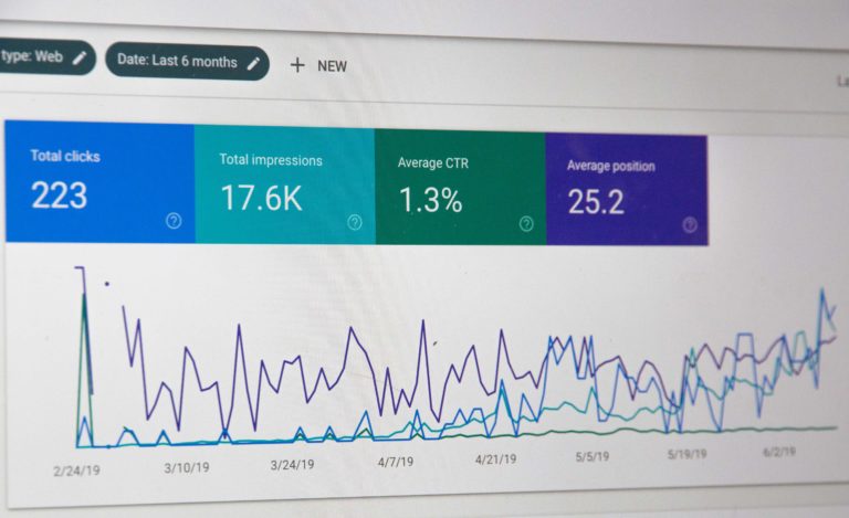
There’s one thing that users hate most about mobile websites: poor navigation. According to a research conducted by Google, 46% of users will abandon a website if it doesn’t load fast enough, and this is mostly due to a poor navigation.
Well, you’ll still have to make sure your mobile site is easy to navigate – for both desktop and mobile users.
An efficient navigation structure is very important for your website, if you want to improve the overall user experience. A good navigation structure should be clear at first glance and should be intuitive, so that users can find their way around your website.
Keep it simple
We have a bad habit of filling our designs with visual noise, making them too ‘busy’, too complex, too ‘cool’. However, according to the best practices for mobile first design :
Good design is a good balance between simplicity and functionality. Good design is not about adding everything you can think of. Good design is about the right amount of the right features. Good design is about maximizing your output with the least amount of input. Good design is about providing a great experience. Good design is about the user, not yourself. Good design is about the product, not the designer. Good design is about the content, not the container. Good design is about the user, not the technology. Good design is about the message, not the medium.
Test on Real Devices
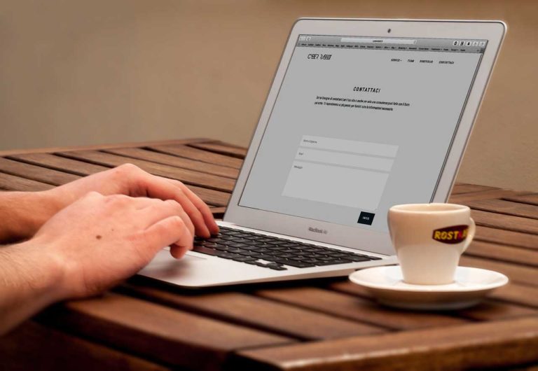
If you are creating a website both for desktop and mobile, then it is essential to test your website using real devices (desktop, smartphones and tablets). It is important to test on real devices to see how the result will be and to check if the render meets your expectations.
There are many different ways of testing your website, but nothing beats testing it on real devices, so that you can see what your users will see. If you are building a website, you always want to test the website on real devices.
With Kleap, you create your website on the mobile first. Like I always said, the desktop version is automatically generated. So the test is easy to do. All you have to do is to preview the result in the desktop version.

Always keep the users in mind
Aside from the technical side of things, mobile-first design is about prioritizing users’ needs. It’s what makes the difference between designing a product with the user in mind and designing a product for yourself or your business. Moreover, I just write a blog post about the creation of a business website if you want to know more about the best practices for mobile first design applied to the business.
It’s about making sure you’re building for them, not for you. Mobile-first design is about putting the user at the center of your product. It’s about ensuring they have what they need, when they need it. This is what makes your product usable, usable, usable. And it’s what makes your users happy.
So, what do your users want? That’s the most important question you must ask yourself when you’re designing a new site, app, or any other form of digital content. If you answer this question before you design anything, you’ll be able to design for your users.
You’ll also be able to learn from your users, which is critical to the success of any product. And you’ll be able to determine if your product is actually working, which is important if you’re trying to sell something. If you’re not thinking about your users, you’re not thinking about design. User-centered design is all about your users. You may think that you don’t know your users very well, but the truth is that you probably know your users better than you think.
All you need to do is ask yourself a few questions about your users to learn more about them : Who is your user? What do they need? What do they want? What are their problems? What are they struggling with? If you know these things, then you’ll be able to design something that your user will actually want. That’s the most important part of user-centered design.
7th best practices for mobile first design : Don’t forget the CTA
Call to action is a widely used feature of websites, particularly those that are looking to boost their sales. Visitors to a website are likely to be scanning the text instead of reading it, and a call to action is a great way to grab their attention and persuade them to take a particular course of action, such as making a purchase.
If you are not using CTAs to drive traffic to your page then you are probably missing out on a lot of traffic. Moreover, we have the adaptive block for the CTA in Kleap, to facilitate its insertion.
Mobile first design is a design strategy for websites and applications. If you want to know more about it, please visit our another blog post about the mobile first approach and its importance. It is one of the most popular trends today and a very good way to make a website usable and accessible for a big audience as long as you do it the right way. In this article we have collected the best practices for mobile first design to have a successful website.


