← Back to Discover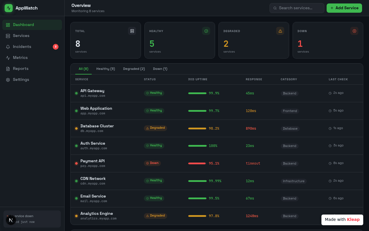
Dashboard
Monitor all your services with a clear, concise overview, ensuring peak performance.
This AppWatch dashboard expertly visualizes complex service statuses with a clean, dark-themed interface, making it easy to identify healthy, degraded, or down services at a glance. Its intuitive layout and real-time updates empower users to maintain operational integrity, proving indispensable for any team managing crucial digital infrastructure.
monitoring
saas
analytics
operations
by m t media
Design7/10
Completeness8/10
Uniqueness6/10
Build your own with AI
Describe what you want and Kleap builds it in minutes. No coding required.
Start building for free