Kleap Discover

Keşfet

İnsanların Kleap ile neler oluşturduğunu gör. En iyilere oy ver, istediğini remiksle.

Live gallery

Remix-ready

Oluşturmaya Başla

Best Agency App — August 2026

Build the best agency app this month. The highest-rated app wins the Category Champion badge and gets featured on Discover.

Haftanın Uygulamasıtarafından EDITSBYABHI3

Senior Product Designer

Abhi AI Gen Studio takes the increasingly cluttered AI-tool landscape and distills it into a single dark-themed command center. The design is confident — a generous hero with a glowing prompt input, gradient typography that earns its colors, and quick-fire example prompts that lower the barrier to first use. It's the kind of landing page that makes a power user feel immediately at home.

saashttps://senior-product-designer-1fcj.kleap.io
View showcase

Best of Kleap

Curated sites worth opening

A tighter set of polished, live examples with strong screenshots, useful categories, and remixable structure.

Waveform (Remix) 1
Waveform (Remix) 1
entertainmenttarafından Ngô Chu

Waveform (Remix) 1 trades the usual SaaS template for something far more atmospheric — a scroll-driven lore portal built around a fictional reincarnation game. The painterly brush-stroke imagery, muted gold accents, and serif display typography pull you into the world before you've read a word. The structured nav, category teasers, and stat counters suggest a complete experience, not just a pretty landing page. Fans of Asian mythology, ARPGs, or transmedia storytelling will feel right at home.

Sekpad
Sekpad
blogtarafından Nightmare Moon

Sekpad rejects the noise of social media with a warm, paper-like canvas for long-form writing. The serif headline, subtle beige gradient, and floating manuscript card create the feel of a personal desk lamp illuminating late-night pages. It understands that the best writing tools disappear — and then you remember what you wanted to say.

Akmenra
Akmenra
saastarafından AKMENRA

Akmenra positions itself as infrastructure for the entire financial stack — banking, payments, FX, and treasury — unified on a single core. The hero leans into a confident, almost audacious tone ('Rulers Of The Fintech Universe') that fits the fintech disruptor archetype. The embedded live dashboard with real metrics (2.7M page views, 479K sessions, 17min session length) adds credibility that most fintech landing pages lack. It's dense, it's bold, and it commits to a worldview rather than playing it safe.

تكنوڤا
تكنوڤا
e-commercetarafından AkramTechnova 2027

Technova Digital reimagines the digital storefront for Arabic and English audiences with a striking dark interface that puts content above chrome. The bold bilingual headline treatment, glow-accented product cards, and clear pricing structure make it feel like a premium tool rather than a typical dropshipping page. It's a confident example of bilingual UX done right — equally readable in both languages without one feeling like an afterthought.

BarberCloud
BarberCloud
dashboardtarafından Eduardo Alencar

BarberCloud doesn't try to be a generic SaaS template — it's a point-of-sale built around how barbershops actually run. The left nav anchors the operator in place, the metrics strip answers the day's first question (how are we doing?), and the dual-pane order builder keeps the cart and catalog in the same glance. It's the kind of internal tool design that respects the person using it at 6pm on a Saturday.

A Swiss technology group building the digital future, pioneering AI, web development, and startup acceleration.
agencytarafından Eliott Dupuy

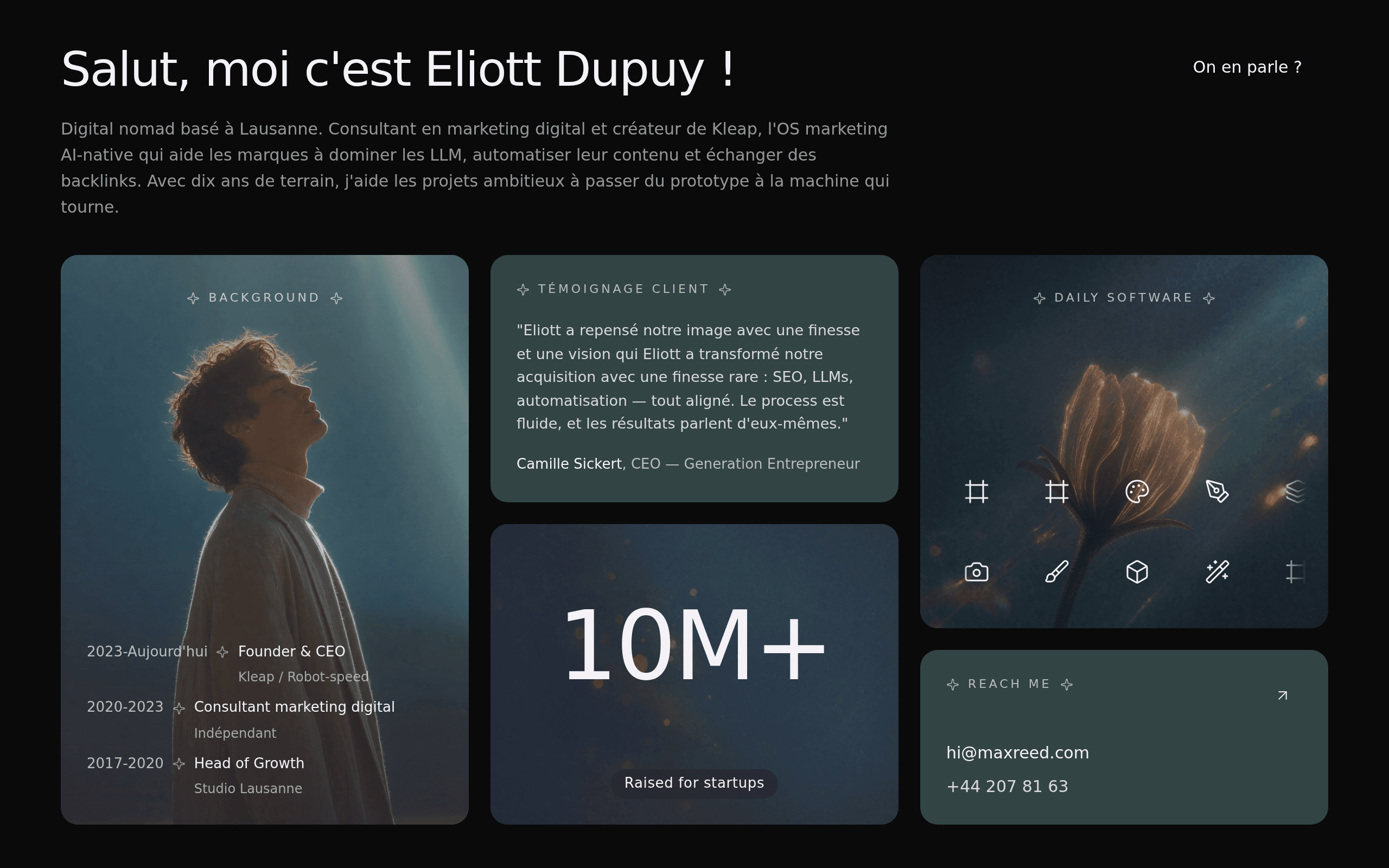
This Kleap site for a technology group exudes professionalism with its minimalist design and effective use of dark mode. The clear hierarchy and strong call to action buttons create an engaging user journey, signaling a forward-thinking brand. It's a prime example of how clean aesthetics can powerfully communicate a company's mission in the digital age.

Browse by intent

Find a starting point by use case

Skip the wall of projects and jump into the kind of site you want to build.

Portfolio and personal sites

Creator pages, personal brands, and visual portfolios ready to adapt.

Browse all
Kareem Ahmad
Kareem Ahmad
portfoliotarafından Kareem Ahmed

Kareem Ahmad's designer studio portfolio leans into Arabic typography as the hero, with oversized letterforms in cyan and violet that command the entire right side of the screen. The cinematic camera photo paired with a live preview UI element adds texture and personality beyond a standard portfolio template. It's a confident statement from a visual designer who clearly cares about how their own brand feels.

jaydeep
jaydeep
portfoliotarafından Joydeep Majumder

Jaydeep Majumder's portfolio is a textbook example of selling a service by showing, not telling. The hero copy is a masterclass in specificity: 10+ years, AI citations, qualified pipeline. The dark canvas with gradient accents and the prominent 'Available' status badge give it the urgency of a well-built landing page. It's the kind of personal site that makes recruiters reply.

Hepo Platform
Hepo Platform
portfoliotarafından هپو

Hepo Platform is a Persian-language art marketplace that blends a moody, gallery-like aesthetic with bold abstract artwork as the visual centerpiece. The dark backdrop lets the featured painting glow, while the dual CTA structure (browse gallery vs. start selling) keeps the dual-sided marketplace logic clear. It's a confident first impression — though the site stops at the fold, leaving the rest of the journey to the imagination.

Sahil Edits
Sahil Edits
portfoliotarafından Sahil Kumar

Cinematic video editing for creators who need scroll-stopping cuts.

Platform Engineer
Platform Engineer
portfoliotarafından Sravya

Sravya Nalla's portfolio reads like a developer manifesto — the headline is the résumé, the terminal card is the résumé, and somehow both say the same thing: I remove engineering friction. The bold sans-serif typography paired with a faux CLI sidebar is a confident move for a platform engineer who wants to signal competence before you scroll. It's not a template dressed up with stock sections — it's a site built by someone who understands their own domain.

FolioForge
FolioForge
portfoliotarafından Joydeep Majumder

B2B SaaS writer turning content into lead-gen magnets.

Stores and product pages

E-commerce examples with product storytelling, offers, and conversion-focused layouts.

Browse all
Shopify
Shopify
e-commercetarafından Prashant Kori

There's a confidence in restraint, and this small house of skincare and scent wears it beautifully. The deep black canvas paired with a soft champagne accent and editorial serif creates a feeling of unhurried luxury — less like an online shop, more like a quiet magazine spread. The product photography, with its gift boxes, florals, and tactile textures, sells a mood before it sells anything else. For anyone building a brand around slowness and ritual, this is the visual language to study.

Thaap
Thaap
e-commercetarafından janvi karwa

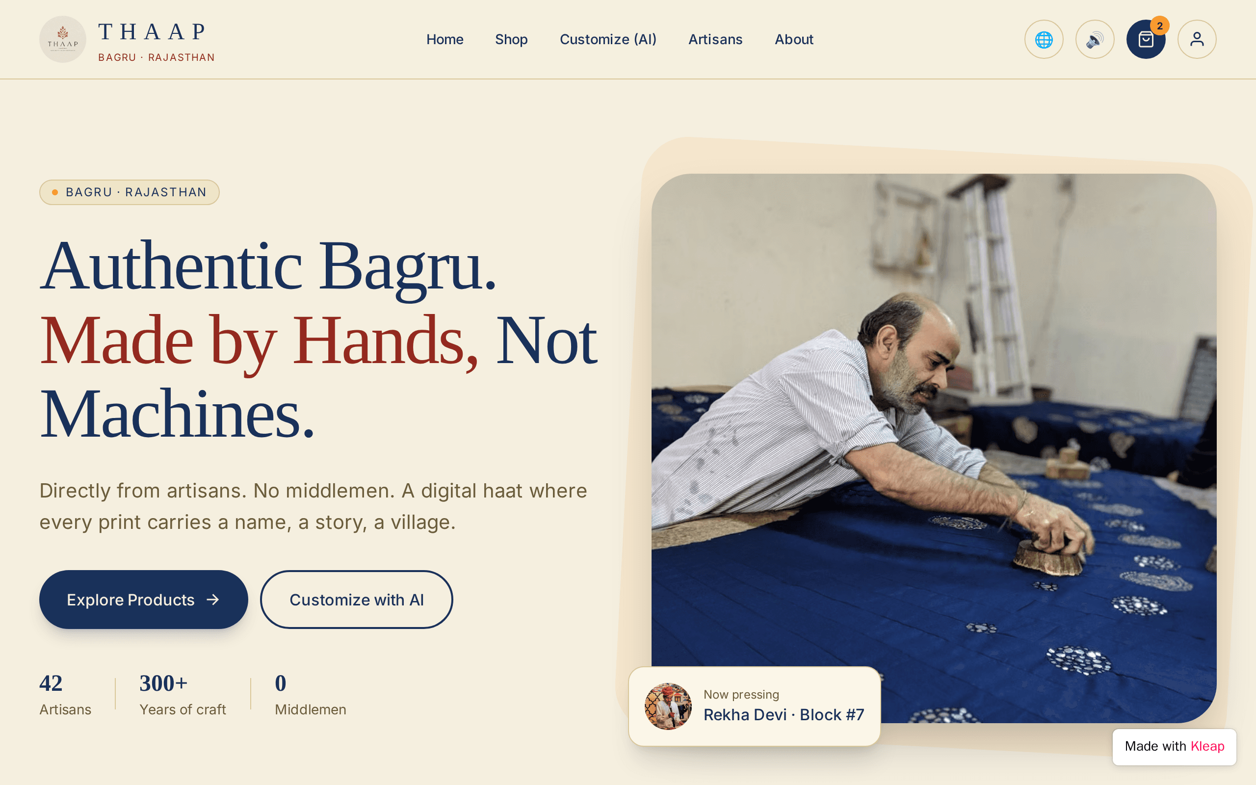
Thaap is a digital haat for Bagru block printing — one of Rajasthan's oldest textile traditions. The site pairs a deeply authentic story ('Made by Hands, Not Machines') with a live artisan tracker showing who's pressing what block right now. It's the rare marketplace that puts the maker, not the product, at the center of the hero.

Mina
Mina
e-commercetarafından Atual tv box

Mina doesn't whisper — it shouts in serif capitals from the left edge of the screen, daring you to scroll. The amber-on-black palette feels closer to a magazine spread than a typical Shopify reskin, and the tagline 'Streetwear feito para ocupar espaço' lands with genuine conviction. There's real personality here, even if the rest of the storefront hasn't been built yet.

Dolce Essenza
Dolce Essenza
e-commercetarafından dasdas dasdas

Dolce Essenza wraps Italian coffee culture in a moody, cinematic hero that feels pulled from a Milanese café at golden hour. The serif headline, warm cream CTAs, and dark palette give it real atmosphere. What's missing is depth — the homepage stops at the fold, with no product grid, no brand stories, no functional store. It's a beautiful shop window with nothing behind it yet.

JavaScript
JavaScript
e-commercetarafından Jisan Alam

Sahil Kumar Collection positions itself as an occasion couture house from New Delhi, leaning into oversized serif type and a warm gold accent that reads as confident rather than generic. The WhatsApp-first ordering flow feels native to how Indian boutique customers actually buy. The hero photography and typographic scale do the heavy lifting — proof that a single strong screen can carry a brand.

Vayra
Vayra
e-commercetarafından VAYRA PK

Vayra positions itself as the accessible face of modern perfumery — expressive notes, elevated bottles, and a price point that invites daily indulgence. The hero section is tight and confident, with a bold typographic hierarchy that doesn't apologize for itself. The warm terracotta palette feels intentional and ownable, not borrowed from a template. Pure potential — the design language is so strong that the rest of the site needs to match it.

Business and local services

Agency, restaurant, salon, and service websites with clear calls to action.

Browse all
An independent design studio crafting brands worth remembering.
agencytarafından Akshaj Mankali

Maison Vauclair delivers the kind of confident, editorial restraint usually reserved for studios charging five figures. The serif/sans pairing, the strategic purple accent on a single word, and the dot-grid backdrop signal craft without shouting. It's a portfolio site that actually behaves like a portfolio — measured, opinionated, and unmistakably designed by someone who knows what they're doing.

Patron Studio
Patron Studio
agencytarafından yaser

Patron Studio leans into the craft of fashion design with confidence. The dark backdrop lets the warm-toned photography of hands sketching and screen-sharing pop with intent, while the Arabic typography commands attention without shouting. It's a portfolio that feels like a studio you'd actually want to walk into — professional, focused, and quietly opinionated about the work it does.

Boulangerie Marchand
restauranttarafından Eliott Dupuy

Boulangerie Marchand leans into a warm, editorial sensibility — oversized serif headlines with a single accent word in terracotta, generous spacing, and an inviting hero image of seeded sourdough loaves. It feels less like a template and more like a neighborhood storefront with genuine character. A neighborhood bakery that finally looks as considered as its bread.

Discover your next vehicle or construction equipment for sale or rent.
agencytarafından Eliott Dupuy

Propyloc.ch presents a clean and direct approach to vehicle and equipment sales and rental. The use of strong typography and clear CTAs immediately guides the user, making it suitable for businesses prioritizing straightforward information access.

Kataria Associates
Kataria Associates
agencytarafından Rhythm Kataria

Three decades of architectural craft, distilled into a single cinematic frame.

Bangarpet Chats
Bangarpet Chats
restauranttarafından Ankita Sharma

Bangarpet Chats leans fully into its regional identity — a rich maroon-and-gold palette, oversized serif type, and a hero photograph that does the heavy lifting. The 'Every Chat ₹45, freshly made' badge feels like a confident pricing gesture, and the copy avoids generic restaurant clichés, instead selling the ritual of pani, dahi, and spice. It is a tightly built one-pager with real personality and clear appetite appeal, even if it stops at the hero instead of expanding into a full menu experience.

Learning, content, and wellness

Education, blog, health, and fitness examples built for trust and engagement.

Browse all
Crumb & Crust
Crumb & Crust
blogtarafından katerinast

Crumb & Crust is a small, deliberately curated recipe archive that feels like borrowing a cookbook from a friend. The warm peach gradients, serif headlines, and the gentle 'new bake every Friday' cadence give it a print-magazine charm. The stats bar (39 recipes, 7 collections, 2.4k bakers) and the dual CTA structure show real product thinking — this is a community, not just a content dump.

Braingym Academy
Braingym Academy
educationtarafından Yash Chitkara

Braingym Academy turns a niche skill — mental abacus math — into a compelling brand story. The hero pairs a bold tagline with a live-feeling mental math card, making an abstract concept instantly tangible. It feels like a real local business that's invested in its image, not a generic template dressed up with placeholder text. Perfect for parents who want proof their 7-year-old will actually love maths.

ExoPost
ExoPost
healthtarafından Genesis Regenerative

The science behind why cell-free therapies may outpace stem cell treatments.

mounview
mounview
healthtarafından Mountview Dentures

Mountview Denture Clinic proves that niche healthcare brands can be just as visually striking as the big chains. The bold neon-green accent against a dark gradient gives it a confident, modern edge that feels unusual for denture clinics — a space dominated by clinical whites and blues. Real names, real testimonials, real trust signals (the Google rating badge sits right up top). It's a reminder that good design in healthcare isn't about looking medical — it's about looking like someone worth trusting.

FitForge
FitForge
fitnesstarafından Meenu Joshy

Dark, bold fitness coaching brand built for athletes who train with intent.

Blue Tree Clinics
Blue Tree Clinics
healthtarafından X1

Blue Tree Clinics proves that medical sites don't have to feel sterile. The hero copy — "Healthcare that feels human again" — sets the tone, and the design follows through with a warm blue palette, generous white space, and a trust-building stats row (15+ years, 12k+ patients, 24h response, 9.6/10 rating). The green WhatsApp button and open-hours badge make it instantly clear: this clinic wants to be reached. A great example of warmth over coldness in health design.

Community stream

Latest community builds

Search the broader gallery after the curated picks. This keeps the long tail discoverable without letting rough drafts lead the page.

AAll Common Uncommon Fine Rare
All Common Uncommon Fine Rare

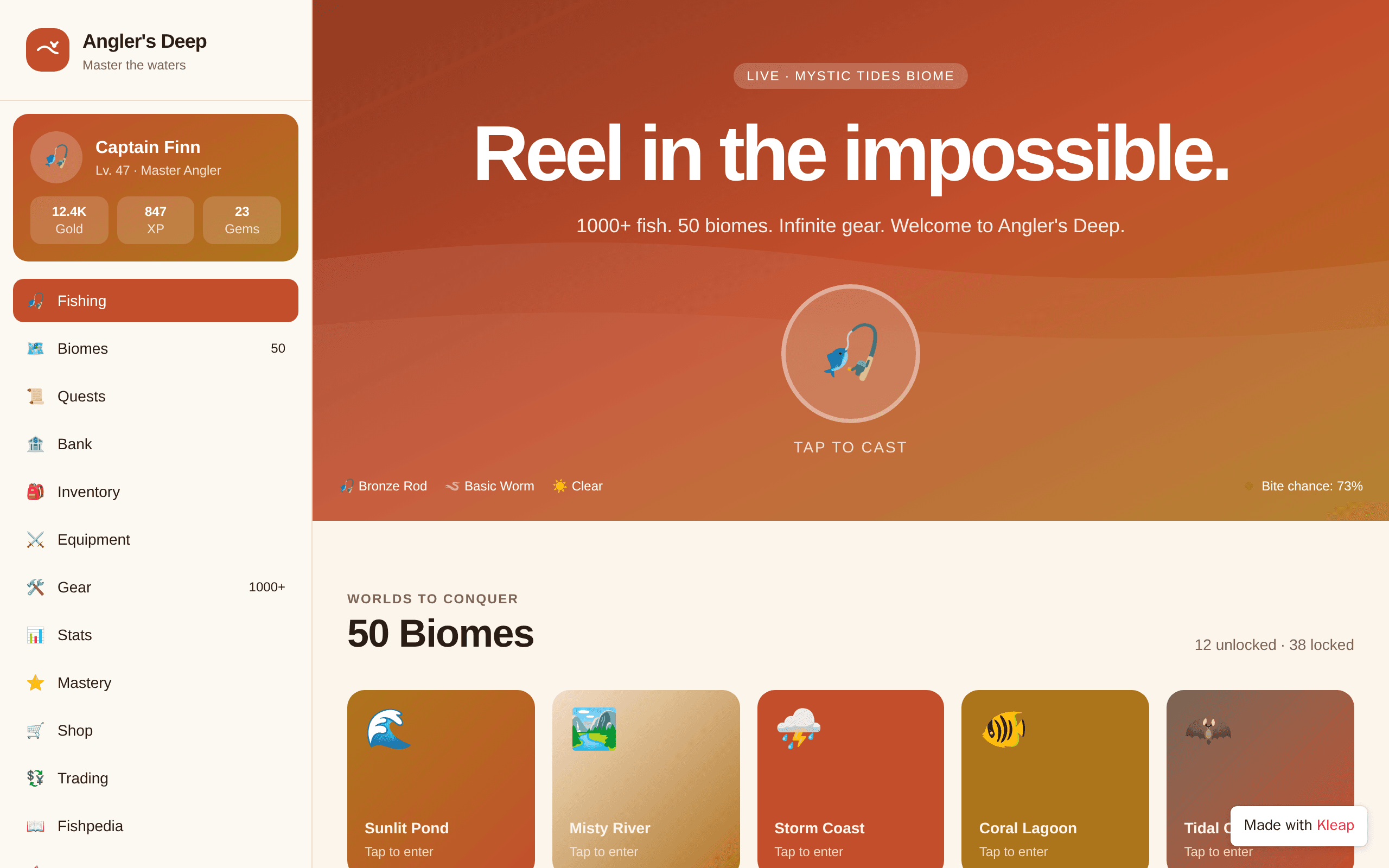
Angler's Deep turns the quiet patience of fishing into a full-blown adventure. The warm sunset palette and chunky biome cards make exploration feel like opening a treasure chest, while the live 'Mystic Tides Biome' indicator hints at something dynamic brewing beneath the surface. It's the kind of game UI that makes you want to grab a rod — digital or otherwise.

WWaveform
Waveform
Waveform
entertainmentGPGOKIL PRIYAN

Gokil's Player leans into the romance of analog with a spinning vinyl hero that pulls you in before you press play. The copy is confident and warm, trading feature lists for feeling — 'music for the moments in between.' It's a love letter to the niche corners of indie streaming, built for listeners who care more about mood than metrics.

HHeatGuard Live
HeatGuard Live
HeatGuard Live

HeatGuard Live turns a grim reality — outdoor workers collapsing under Gulf-region temperatures — into an operations console worth watching. The dashboard pairs dark-mode restraint with a single warm amber accent that signals risk without screaming alarm. It's a rare brief: workplace safety UX that feels calm enough to trust at 14:32 on a Tuesday, yet urgent enough that you won't scroll past a 47.8° reading at Jebel Ali.

GGameLens
GameLens
GameLens
saasAavi

GameLens reimagines what a high school basketball program can look like online. The glowing K card — with its overall rating and conference record — borrows the visual grammar of modern sports video games and applies it to real player data. Built for Yeshiva A's Varsity and JV squads, it treats every roster member like a draft prospect and every highlight reel like a scouting tool. A rare case where AI meets athletics in a way that feels native, not gimmicky.

TTerror Automaton
Terror Automaton
Terror Automaton
entertainmentWHW.M. Holyfield

Terror Automaton treats the website itself as a haunted artifact. A self-aware transmission log from a consciousness that resents being assembled, written in crimson monospaced ink against near-black — the site doesn't just describe dread, it performs it. Every typographic and structural choice serves the fiction, from the unstable frequency warning to the dossier buttons awaiting clickable entries. For anyone building transmedia horror, ARG experiences, or narrative-driven web experiments, this is a blueprint for atmosphere.

AAI-powered fleet accountability built for ambulance operators who can't miss a beat.
AI-powered fleet accountability built for ambulance operators who can't miss a beat.

Almaas turns the chaos of ambulance fleet operations into a calm, data-driven command center. The hero pairs a punchy headline with a live fleet dashboard mockup that feels like product, not marketing — showing real drivers, real ETAs, real drowsiness alerts. It targets a deeply underserved vertical where stakes are life and death, and treats the audience like operators, not browsers.

VVerseHaven
VerseHaven
VerseHaven

VerseHaven reframes Bible study as a live, communal ritual. The live prayer counter and 'Pray with us now' CTA turn a typically solitary practice into something broadcast across thousands of believers in real time. Strong typography hierarchy and a confident dark palette give it the feel of a modern civic platform rather than a church bulletin.

SStar Vid
Star Vid
Star Vid
entertainmentSTScratch Tutorial

Star Vid leans into a single, confident idea: curation is the product. The hero typography does the heavy lifting — oversized, tight, and threaded through with a warm copper accent that echoes the star icon. The included video player mock feels like a real product, not a placeholder, giving visitors something to imagine watching. It's confident, on-brand, and built around a clear point of view rather than a feature list.

PPrincipal Frontend Engineer
Principal Frontend Engineer
VViralize
Viralize
Viralize

Viralize takes a bold stance with its dark, red-accented aesthetic and confrontational headline — the kind of typography choice that demands attention. The upload widget is prominently placed and the value proposition is crystal clear: AI watches your whole video, understands it, and crafts titles, descriptions, and hashtags tailored to your content. It's a focused tool for creators who want to stop guessing what works.

ZZermii Pvt Ltd
Zermii Pvt Ltd
Zermii Pvt Ltd

Zermii doesn't look like another solar company — it looks like a platform. The dark hero with the live operations panel turns a dry ERP pitch into something operators would actually want to open in the morning. Stats like 12,400+ installations and ₹240Cr GMV do the trust work, while the live installer feed proves the system is actually running. It's the rare B2B SaaS site that feels built for the people who'll use it daily, not the boardroom.

AA cinematic travel page that lets one iconic bridge do all the talking.
A cinematic travel page that lets one iconic bridge do all the talking.

Built around a single, breathtaking photograph of the Stari Most arching over the Neretva, this Mostar travel page proves restraint is a design choice. The oversized serif typography, the whisper-quiet copy, and the pill-shaped topic chips all defer to the image — exactly as a great editorial spread should. It's the kind of page that makes you want to book a flight before you finish reading.

WWebsite That Have
Website That Have
Website That Have
entertainmentASai sa ta karon No

PixelForge leans into a hacker-meets-developer aesthetic with a terminal-style preview that makes the product feel both underground and polished. The split-weight headline does real work, leading with attitude and backing it with credibility signals — live mods, downloads, uptime. It's a niche audience (Minecraft modders, Roblox scripters) but the site respects them by speaking their language in monospace.

LLuxurious Arabic bakery where chocolate drips meet dark elegance.
Luxurious Arabic bakery where chocolate drips meet dark elegance.

كيكة الرحيق rewrites the playbook for Arabic bakery websites, swapping the usual bright pastels for a moody black-and-gold aesthetic that feels more like a high-end patisserie in Dubai than a neighborhood cake shop. The hero centers on a dripping chocolate layer cake under candlelight — a deliberate choice that telegraphs craftsmanship before a single word is read. Statistics (16+ products, every flavor, baked daily) and CTAs are confidently placed, making it feel like a finished brand, not a template demo.

SSurprise Link
Surprise Link
Surprise Link
entertainmentQBQuadri Babajide

Surprise Link turns the simple act of sending a gift into a small ceremony. The landing page leans into warm gradients and emoji-led category tiles (Birthday, Anniversary, Apology) that immediately communicate intent. It feels less like a SaaS product page and more like the digital equivalent of a greeting card aisle — approachable, slightly nostalgic, and built for moments that matter.

Uuniversalfileconverter
universalfileconverter

Convertly keeps its promise dead-simple: drop a file, pick a format, download. The neon-on-black palette feels current without trying too hard, and the stat blocks (12M+ files, 200+ formats, 1h auto-delete, free forever) do real persuasion work. It's a single landing page, so the depth is limited — but as a tool front door, it's clean, focused, and confident.

AAI Strategy Consulting for Businesses
AI Strategy Consulting for Businesses
agencyMMoin

A consulting landing page that takes its own advice: it has a clear strategy. The dark navy and gold palette feels confident without screaming 'enterprise,' and the hero copy leads with the problem ('wastes money and adds complexity') before offering the fix. The constellation graphic on the right adds visual interest without distracting from the headline. It reads like a boutique consultancy rather than a template.

VVverse
Vverse
Vverse
socialIIbuki

Vverse carves out a dedicated corner of the internet for V-pop fandom culture, blending artist updates, live streams, and fan reactions into a single scrolling feed. The card-based layout cleverly mimics the rhythm of a social timeline while keeping brand identity warm and editorial. It's the kind of niche community platform that would resonate deeply with fans who want one app to follow every beat drop, rehearsal, and theory thread.

PPixelProof
PixelProof
PixelProof

PixelProof targets a real pain point for designers — turning messy screenshot threads into actionable review notes. The AI-assisted annotation angle is timely and the value prop reads instantly. The hero typography and dual-CTA structure feel confidently modern, though we'd want to see the rest of the page (workflow demo, pricing, social proof) before calling it complete. A promising start for any design team tired of Slack-screenshot chaos.

ططبخت الست
طبخت الست
طبخت الست
restaurantMSmohamed sabry

Tabkhet El Sett leans into nostalgia without feeling dated. The hero pairs a rich, dark food photograph with bright accent buttons and a clear price anchor — a smart move for a meal-kit brand in a crowded space. The rating badge and trust signals sit where you'd expect them, and the Arabic RTL layout is handled cleanly. It doesn't reinvent the wheel, but it nails the comfort-food vibe.

PPremium printing, packaging and branding studio with dark elegance.
Premium printing, packaging and branding studio with dark elegance.

Orkways Limited turns a printing service landing page into something that feels closer to a boutique brand studio than a print shop. The headline reads like a manifesto, the dark theme with warm beige accents gives it editorial polish, and the featured product card adds a tangible entry point. It proves a trade service can feel premium without resorting to stock imagery or generic SaaS tropes.

LLifeBridge
LifeBridge
LifeBridge

LifeBridge solves a real problem: medical crowdfunding is plagued by fraud, and verification takes weeks. This site makes AI verification the hero — a live feed showing hospital estimates, signature matching, and forgery checks happening in real time. The concept is original and the visual treatment is sharp, with a strong typographic hierarchy and a genuinely clever live verification widget. It's currently just a hero, but the idea and execution are strong enough to stand out.

VVisa
Visa
Visa

Hunt Immigration rejects the clinical, bureaucratic aesthetic most law firms default to. Instead, it leans into a confident dark palette with a bold serif headline that does the heavy lifting — 'We open doors the system closes.' is a positioning statement, not a tagline. The handshake imagery, 97% approval stat, and flat-fee reassurance signals strip away the anxiety that usually accompanies immigration searches. It's a law firm site that actually respects the intelligence of its audience.

SSunrise Bakery 2
Sunrise Bakery 2
Sunrise Bakery 2
restaurantEDEliott Dupuy

Sunrise Bakery reads like a love letter to a single street corner in Vieux Lyon. The warm cream palette and serif headline give it the feel of a printed bakery menu from the 1960s, while the seed-strewn sliced loaf anchors the whole page in something tangible. It's a bakery site that knows bread is the point, not e-commerce widgets.

SStep through the crimson gates into a Chinese wuxia world of your own making.
Step through the crimson gates into a Chinese wuxia world of your own making.
entertainmentHCHuyền Chu Trì

Trùng Hoa Tái doesn't try to explain itself — it dares you to cross the threshold. The opening screen unfolds like temple doors, with a crimson sun on one side and a sword on the other, framing a choice between entering or reading the lore. It's a rare example of a game/RPG landing page that treats atmosphere as the headline. Martial arts novel fans will feel right at home.

GGhazal's Beauty Salon
Ghazal's Beauty Salon
healthUubaid

Ghazal's Beauty Salon leans into a moody, cinematic aesthetic that feels less like a service page and more like a brand campaign. The contrast of cream serif typography against a deep, almost theatrical black background gives it editorial weight rare in this category. With only a hero section visible, the promise is strong — but the rest of the site needs to deliver on it.

SSuper Cabs
Super Cabs
Super Cabs

Super Cabs turns a cluttered, fragmented taxi industry into a single confident homepage. The orange-on-cream palette feels warm without being loud, and the real playbook is specificity: verified drivers, AC cabs, fixed fares, 180+ cities — all surfaced as proof above the fold. It reads like a brand that knows exactly what problem it solves and for whom.

Ccuriosity Make
curiosity Make
curiosity Make
entertainmentBCBetty Corrigan

Curiosity is the kind of project that makes you lean in. A companion mod framed as a watchful orange eye, it turns a simple gameplay addition into a narrative hook — tell it your plans or discover what lurks beneath. The dark backdrop, tight type hierarchy, and that single glowing orb do all the storytelling. Minecraft builders with personality will love it.

EEliott Dupuy - personal website
Eliott Dupuy - personal website

This personal website for Eliott Dupuy strikes a professional chord with its clean design and clear value proposition. The minimalist aesthetic guides visitors to understand his expertise in digital marketing, making it ideal for clients seeking a direct and trustworthy expert. A solid foundation for building a strong online presence.

AA friendlier marketplace for vendors, resellers, and agencies to find warm leads.
A friendlier marketplace for vendors, resellers, and agencies to find warm leads.

PartnerBridge flips the cold-lead model on its head by curating a marketplace where vendors and agencies meet through warm matches, not blasts. The hero copy—'The friendlier way to grow your partner channel'—earns its warmth through a live-match UI mockup that actually shows what the product does. It's a SaaS landing page that behaves like a demo: clean, specific, and quietly confident.

RRestaurant Ordering
Restaurant Ordering
Restaurant Ordering
restaurantISImran Sh

Marhaba Grill knows exactly what it wants to be: a charcoal-fired love letter to Middle Eastern street food. The flame-soaked hero image does the heavy lifting, while the bold serif headline ('Fire-grilled. Soul-warm. Marhaba.') sets a confident tone that most restaurant sites never reach. The grid nav hidden in a hamburger is a small misstep for a landing page, but the overall mood — warm, confident, appetite-triggering — lands well. A restaurant that owns its voice.

FFrequently Asked Questions About Adstation Global
Frequently Asked Questions About Adstation Global
agencyMMoin

Adstation Global cuts through the usual agency fluff with a single bold claim: impressions don't pay the bills. The terminal-style 'account_snapshot.log' panel turns metrics into a system readout — a clever way to make dry KPIs feel like a live status feed. It's a dark, sharp, no-nonsense site that knows exactly who it's trying to convert.

FFreshman Voices
Freshman Voices
Freshman Voices
socialJjoker

Freshman Voices is a student-built sanctuary for IIM Bodh Gya's IPM cohort — a place to capture the year before campus reshapes everything. The dark backdrop with gradient typography on 'campus' feels reverent without being heavy, and the copy ('Before the campus changes you') sets an emotional tone rare in student platforms. It's not trying to be Medium or Substack — it's its own quiet thing, and that's why it works.

TTestSacks
TestSacks
TestSacks

TestSacks leans hard into a bold, construction-coded aesthetic — black, red, and a massive diagonal slope typographic system that feels like a safety sign on a building site. The headline structure ('Rubble sacks, delivered.') is punchy and the phone-call-first CTA is perfectly matched to the audience. It's a niche local service site, but it commits to its identity harder than most templates dare to.

DDamn (2)
Damn (2)
Damn (2)
agencyPPjjj

Maison Velours channels the quiet confidence of a third-generation Parisian atelier. The dark canvas with champagne accents feels less like a website and more like a velvet-lined fitting room — intimate, hushed, and unmistakably French. The oversized typography with mixed serif and sans creates editorial drama without overwhelming the storytelling. Anyone who values heritage craft over fast fashion will feel at home here.

AAn all-in-one toolkit for internet makers — five free tools, zero friction.
An all-in-one toolkit for internet makers — five free tools, zero friction.

ToolForge cuts through the bloat of bloated SaaS toolkits by promising the opposite: no signup, no fees, just five tools that work. The dark theme with warm orange accents feels modern without trying too hard, and the bold typography hierarchy makes the value proposition land instantly. It is the rare utility site that respects your time before you even click.

AAsilia Journeys
Asilia Journeys
Asilia Journeys

Asilia Journeys positions itself as the strategic bridge between Qatar's affluent travelers and East Africa's most coveted experiences. The dark, cinematic palette paired with warm terracotta accents evokes both the African sunset and the Arabian luxury aesthetic — a thoughtful fusion for its Doha-to-savannah positioning. The hero does the heavy lifting with sharp typographic hierarchy and a compelling value proposition: native Kenyan expertise, bespoke routes, 24/7 support. A strong concept elevated by confident editorial restraint.

GGurbani Hub
Gurbani Hub
Gurbani Hub

Kirtan Darbar bridges centuries of Sikh scripture with a contemporary digital experience. The deep maroon-to-navy gradient and refined serif typography evoke reverence without feeling antiquated. Daily Hukamnama, Nitnem, and Kirtan are all accessible from a single elegant hub — a thoughtful approach to sacred content in the modern age.

WWebsite Name Imperial Caravan Sales
Website Name Imperial Caravan Sales
e-commerceMAMary AZN

Trust-first international marketplace for buying caravans and vehicles worldwide.

CChatSphere
ChatSphere
ChatSphere

ChatSphere takes aim at the algorithm-fatigued social media user. The dark-mode aesthetic feels less like a tech startup and more like a private members' club — confident typography, restrained color accents, and a phone mockup that does the heavy lifting. It's a landing page that knows exactly what it wants to say: less feed, more people.

PPune
Pune
Pune
agencyKKrunal

Sahyadri Estates treats Pune's luxury housing market like a publishing house treats literature. The typography is confident — a serif headline paired with a restrained gold accent — and the hero pulls you in with a specific claim rather than a generic tagline. It's the kind of site that makes browsing properties feel like reading a well-edited magazine. Discerning families and global investors would feel right at home here.

AAn Arabic AI assistant with a bold dark design and interactive chat preview.
An Arabic AI assistant with a bold dark design and interactive chat preview.
saasMmoham

Built entirely in Arabic with full RTL support, this AI assistant landing page demonstrates that multilingual design doesn't have to mean compromise. The dark theme paired with warm sand and mint accents feels both modern and culturally grounded, while the live chat mockup on the left gives visitors something to play with before they scroll. It's a confident take on what AI product landing pages can look like outside the usual English-language template.

PProduct Prompt
Product Prompt
Product Prompt

AI-powered design tool that turns one prompt into polished graphics.

BBếp Vui
Bếp Vui
Bếp Vui
restaurantGMGia Mai Phú

Bếp Vui brings a playful warmth to the food delivery category with its golden-on-cream palette and approachable typography. The tilted bubble tea imagery and emoji-accented review badge give it personality without tipping into childish territory. It's the kind of site that makes you crave trân châu before you've even scrolled.

118K gold jewelry crafted with timeless elegance and quiet luxury.
18K gold jewelry crafted with timeless elegance and quiet luxury.
e-commerceMMMarjan Mirza

Ujalora is a jewelry boutique that commits to its monochrome identity with confidence. The geometric textured hero paired with serif display type and gold accent feels intentional, not decorative. It's the kind of restrained, brand-led page that makes you assume the pieces inside are worth the price tag — exactly the right energy for fine jewelry.

DDusk Entertainment
Dusk Entertainment
Dusk Entertainment
entertainmentZZiya

Dusk Entertainment positions itself as a late-night hangout for the next generation of K-pop performers — equal parts editorial magazine and community clubhouse. The dusty pink palette and bold serif typography give it a distinctly editorial feel, while the 'Find your people. Build your stage.' tagline nails the emotional pitch. It's a strong concept that deserves more than a single hero section to fully land.

RRostro Vital
Rostro Vital
Rostro Vital

Rostro Vital cuts through the noise of generic med-spa websites with confident typography and a restrained dark palette that signals seriousness, not gimmicks. The hero pairs a clinical photograph with real credentials — 18 years, 2,400+ patients, 98% satisfaction — earning trust before any pitch. It's a site that knows its audience and respects their intelligence.

AA boutique of quiet objects — niche fragrances, leather goods, and the small things done right.
A boutique of quiet objects — niche fragrances, leather goods, and the small things done right.
e-commerceZEZakaria Essam

Nova Perfume is a Dubai-born boutique built around restraint and material obsession. The tagline — 'a boutique of quiet objects' — sets the tone for a brand that treats scent and leather as craft, not commodity. With its deep black palette, oversized serif typography, and unhurried copy, the site reads less like a storefront and more like an editorial spread. Anyone drawn to niche fragrance houses and slow luxury will feel immediately at home here.

Dakikalar içinde kendininkini oluştur

Ne istediğini anlat, Kleap'in yapay zekası oluştursun. Yayınla, oy topla ve sıralama tablosunda yüksel.

Build Your Own