← Back to Discover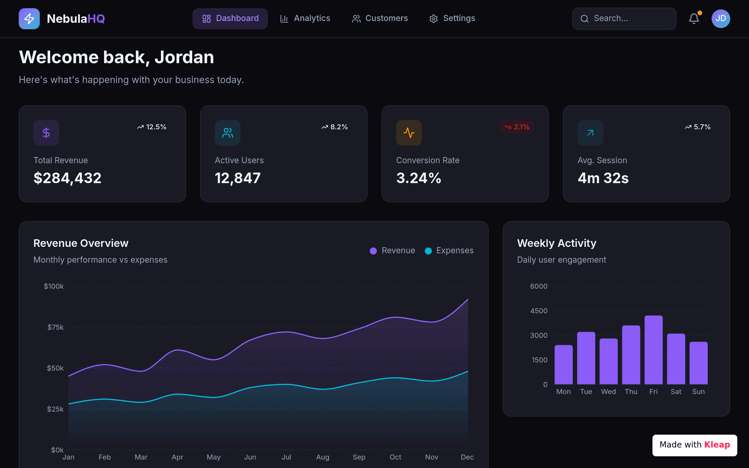
Dashboard
NebulaHQ
A SaaS dashboard with KPI cards, revenue trends, and weekly activity at a glance.
NebulaHQ gets the dashboard fundamentals right — four KPI tiles with trend indicators up top, a dual-line revenue vs expenses chart, and a weekly activity bar graph filling the second row. The dark-mode treatment is consistent and the hierarchy leads the eye from headline numbers to deeper data. A bit predictable in layout and palette, but functional and clean enough to actually use.
dashboard
saas
analytics
dark-theme
Design7/10
Completeness7/10
Uniqueness5/10
Build your own with AI
Describe what you want and Kleap builds it in minutes. No coding required. Need something like this for your team? Try Kleap's AI internal tool builder.
Start building for free