Kleap Discover
AI-built websites you can remix
Explore real websites launched with Kleap. Open the best examples, remix their structure, and ship your own version in minutes.
Best Agency App — August 2026
Build the best agency app this month. The highest-rated app wins the Category Champion badge and gets featured on Discover.
Senior Product Designer
Abhi AI Gen Studio takes the increasingly cluttered AI-tool landscape and distills it into a single dark-themed command center. The design is confident — a generous hero with a glowing prompt input, gradient typography that earns its colors, and quick-fire example prompts that lower the barrier to first use. It's the kind of landing page that makes a power user feel immediately at home.
Best of Kleap
Curated sites worth opening
A tighter set of polished, live examples with strong screenshots, useful categories, and remixable structure.
Browse by intent
Find a starting point by use case
Skip the wall of projects and jump into the kind of site you want to build.
Portfolio and personal sites
Creator pages, personal brands, and visual portfolios ready to adapt.
Stores and product pages
E-commerce examples with product storytelling, offers, and conversion-focused layouts.
Business and local services
Agency, restaurant, salon, and service websites with clear calls to action.
Learning, content, and wellness
Education, blog, health, and fitness examples built for trust and engagement.
Community stream
Latest community builds
Search the broader gallery after the curated picks. This keeps the long tail discoverable without letting rough drafts lead the page.

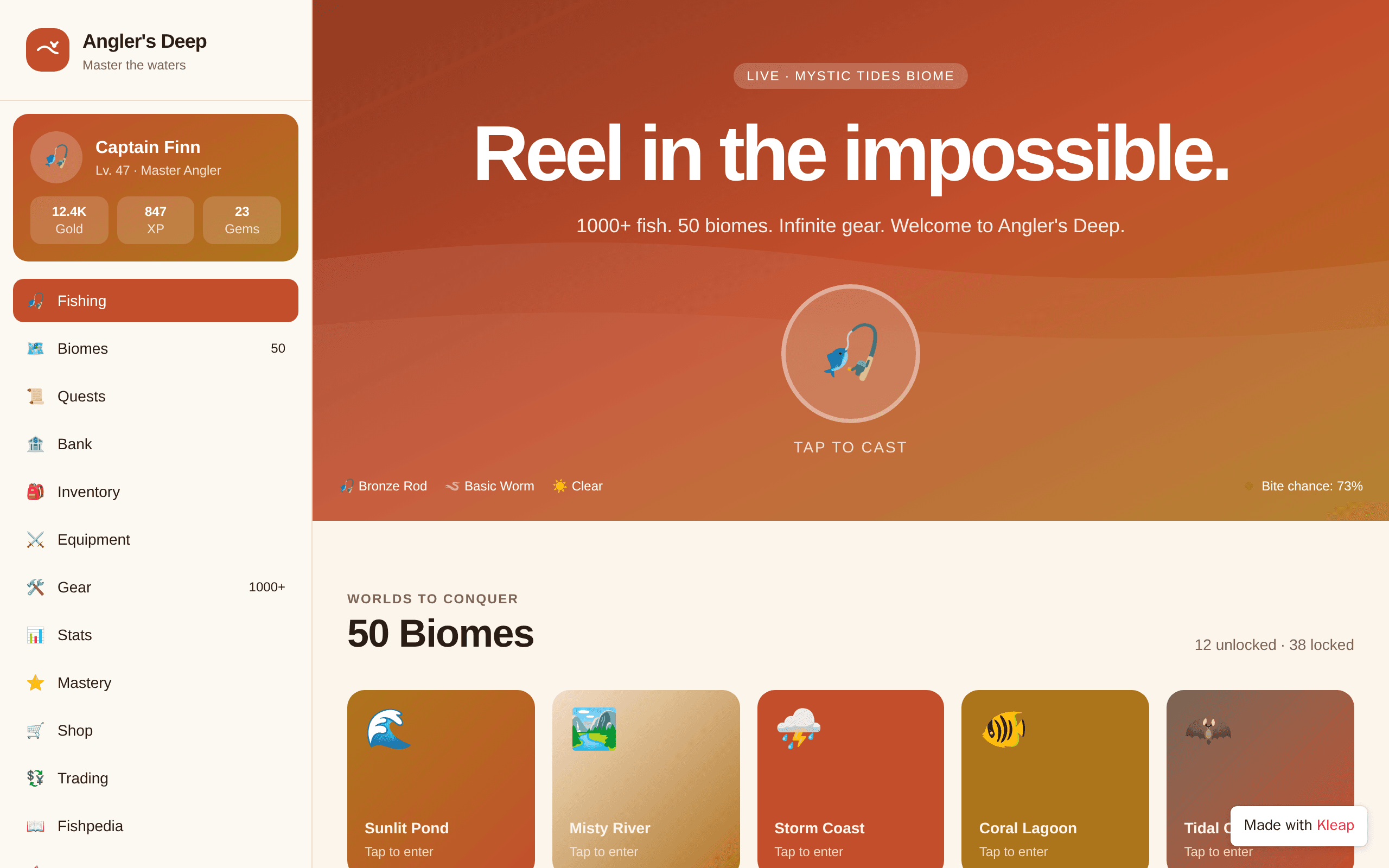
Angler's Deep turns the quiet patience of fishing into a full-blown adventure. The warm sunset palette and chunky biome cards make exploration feel like opening a treasure chest, while the live 'Mystic Tides Biome' indicator hints at something dynamic brewing beneath the surface. It's the kind of game UI that makes you want to grab a rod — digital or otherwise.

Gokil's Player leans into the romance of analog with a spinning vinyl hero that pulls you in before you press play. The copy is confident and warm, trading feature lists for feeling — 'music for the moments in between.' It's a love letter to the niche corners of indie streaming, built for listeners who care more about mood than metrics.

HeatGuard Live turns a grim reality — outdoor workers collapsing under Gulf-region temperatures — into an operations console worth watching. The dashboard pairs dark-mode restraint with a single warm amber accent that signals risk without screaming alarm. It's a rare brief: workplace safety UX that feels calm enough to trust at 14:32 on a Tuesday, yet urgent enough that you won't scroll past a 47.8° reading at Jebel Ali.

GameLens reimagines what a high school basketball program can look like online. The glowing K card — with its overall rating and conference record — borrows the visual grammar of modern sports video games and applies it to real player data. Built for Yeshiva A's Varsity and JV squads, it treats every roster member like a draft prospect and every highlight reel like a scouting tool. A rare case where AI meets athletics in a way that feels native, not gimmicky.

Terror Automaton treats the website itself as a haunted artifact. A self-aware transmission log from a consciousness that resents being assembled, written in crimson monospaced ink against near-black — the site doesn't just describe dread, it performs it. Every typographic and structural choice serves the fiction, from the unstable frequency warning to the dossier buttons awaiting clickable entries. For anyone building transmedia horror, ARG experiences, or narrative-driven web experiments, this is a blueprint for atmosphere.

Almaas turns the chaos of ambulance fleet operations into a calm, data-driven command center. The hero pairs a punchy headline with a live fleet dashboard mockup that feels like product, not marketing — showing real drivers, real ETAs, real drowsiness alerts. It targets a deeply underserved vertical where stakes are life and death, and treats the audience like operators, not browsers.

VerseHaven reframes Bible study as a live, communal ritual. The live prayer counter and 'Pray with us now' CTA turn a typically solitary practice into something broadcast across thousands of believers in real time. Strong typography hierarchy and a confident dark palette give it the feel of a modern civic platform rather than a church bulletin.

Star Vid leans into a single, confident idea: curation is the product. The hero typography does the heavy lifting — oversized, tight, and threaded through with a warm copper accent that echoes the star icon. The included video player mock feels like a real product, not a placeholder, giving visitors something to imagine watching. It's confident, on-brand, and built around a clear point of view rather than a feature list.


Viralize takes a bold stance with its dark, red-accented aesthetic and confrontational headline — the kind of typography choice that demands attention. The upload widget is prominently placed and the value proposition is crystal clear: AI watches your whole video, understands it, and crafts titles, descriptions, and hashtags tailored to your content. It's a focused tool for creators who want to stop guessing what works.

Zermii doesn't look like another solar company — it looks like a platform. The dark hero with the live operations panel turns a dry ERP pitch into something operators would actually want to open in the morning. Stats like 12,400+ installations and ₹240Cr GMV do the trust work, while the live installer feed proves the system is actually running. It's the rare B2B SaaS site that feels built for the people who'll use it daily, not the boardroom.

كيكة الرحيق rewrites the playbook for Arabic bakery websites, swapping the usual bright pastels for a moody black-and-gold aesthetic that feels more like a high-end patisserie in Dubai than a neighborhood cake shop. The hero centers on a dripping chocolate layer cake under candlelight — a deliberate choice that telegraphs craftsmanship before a single word is read. Statistics (16+ products, every flavor, baked daily) and CTAs are confidently placed, making it feel like a finished brand, not a template demo.

Surprise Link turns the simple act of sending a gift into a small ceremony. The landing page leans into warm gradients and emoji-led category tiles (Birthday, Anniversary, Apology) that immediately communicate intent. It feels less like a SaaS product page and more like the digital equivalent of a greeting card aisle — approachable, slightly nostalgic, and built for moments that matter.

Convertly keeps its promise dead-simple: drop a file, pick a format, download. The neon-on-black palette feels current without trying too hard, and the stat blocks (12M+ files, 200+ formats, 1h auto-delete, free forever) do real persuasion work. It's a single landing page, so the depth is limited — but as a tool front door, it's clean, focused, and confident.

A consulting landing page that takes its own advice: it has a clear strategy. The dark navy and gold palette feels confident without screaming 'enterprise,' and the hero copy leads with the problem ('wastes money and adds complexity') before offering the fix. The constellation graphic on the right adds visual interest without distracting from the headline. It reads like a boutique consultancy rather than a template.

Vverse carves out a dedicated corner of the internet for V-pop fandom culture, blending artist updates, live streams, and fan reactions into a single scrolling feed. The card-based layout cleverly mimics the rhythm of a social timeline while keeping brand identity warm and editorial. It's the kind of niche community platform that would resonate deeply with fans who want one app to follow every beat drop, rehearsal, and theory thread.

PixelProof targets a real pain point for designers — turning messy screenshot threads into actionable review notes. The AI-assisted annotation angle is timely and the value prop reads instantly. The hero typography and dual-CTA structure feel confidently modern, though we'd want to see the rest of the page (workflow demo, pricing, social proof) before calling it complete. A promising start for any design team tired of Slack-screenshot chaos.

Tabkhet El Sett leans into nostalgia without feeling dated. The hero pairs a rich, dark food photograph with bright accent buttons and a clear price anchor — a smart move for a meal-kit brand in a crowded space. The rating badge and trust signals sit where you'd expect them, and the Arabic RTL layout is handled cleanly. It doesn't reinvent the wheel, but it nails the comfort-food vibe.

Orkways Limited turns a printing service landing page into something that feels closer to a boutique brand studio than a print shop. The headline reads like a manifesto, the dark theme with warm beige accents gives it editorial polish, and the featured product card adds a tangible entry point. It proves a trade service can feel premium without resorting to stock imagery or generic SaaS tropes.

LifeBridge solves a real problem: medical crowdfunding is plagued by fraud, and verification takes weeks. This site makes AI verification the hero — a live feed showing hospital estimates, signature matching, and forgery checks happening in real time. The concept is original and the visual treatment is sharp, with a strong typographic hierarchy and a genuinely clever live verification widget. It's currently just a hero, but the idea and execution are strong enough to stand out.

Hunt Immigration rejects the clinical, bureaucratic aesthetic most law firms default to. Instead, it leans into a confident dark palette with a bold serif headline that does the heavy lifting — 'We open doors the system closes.' is a positioning statement, not a tagline. The handshake imagery, 97% approval stat, and flat-fee reassurance signals strip away the anxiety that usually accompanies immigration searches. It's a law firm site that actually respects the intelligence of its audience.

Sunrise Bakery reads like a love letter to a single street corner in Vieux Lyon. The warm cream palette and serif headline give it the feel of a printed bakery menu from the 1960s, while the seed-strewn sliced loaf anchors the whole page in something tangible. It's a bakery site that knows bread is the point, not e-commerce widgets.

Trùng Hoa Tái doesn't try to explain itself — it dares you to cross the threshold. The opening screen unfolds like temple doors, with a crimson sun on one side and a sword on the other, framing a choice between entering or reading the lore. It's a rare example of a game/RPG landing page that treats atmosphere as the headline. Martial arts novel fans will feel right at home.

Super Cabs turns a cluttered, fragmented taxi industry into a single confident homepage. The orange-on-cream palette feels warm without being loud, and the real playbook is specificity: verified drivers, AC cabs, fixed fares, 180+ cities — all surfaced as proof above the fold. It reads like a brand that knows exactly what problem it solves and for whom.

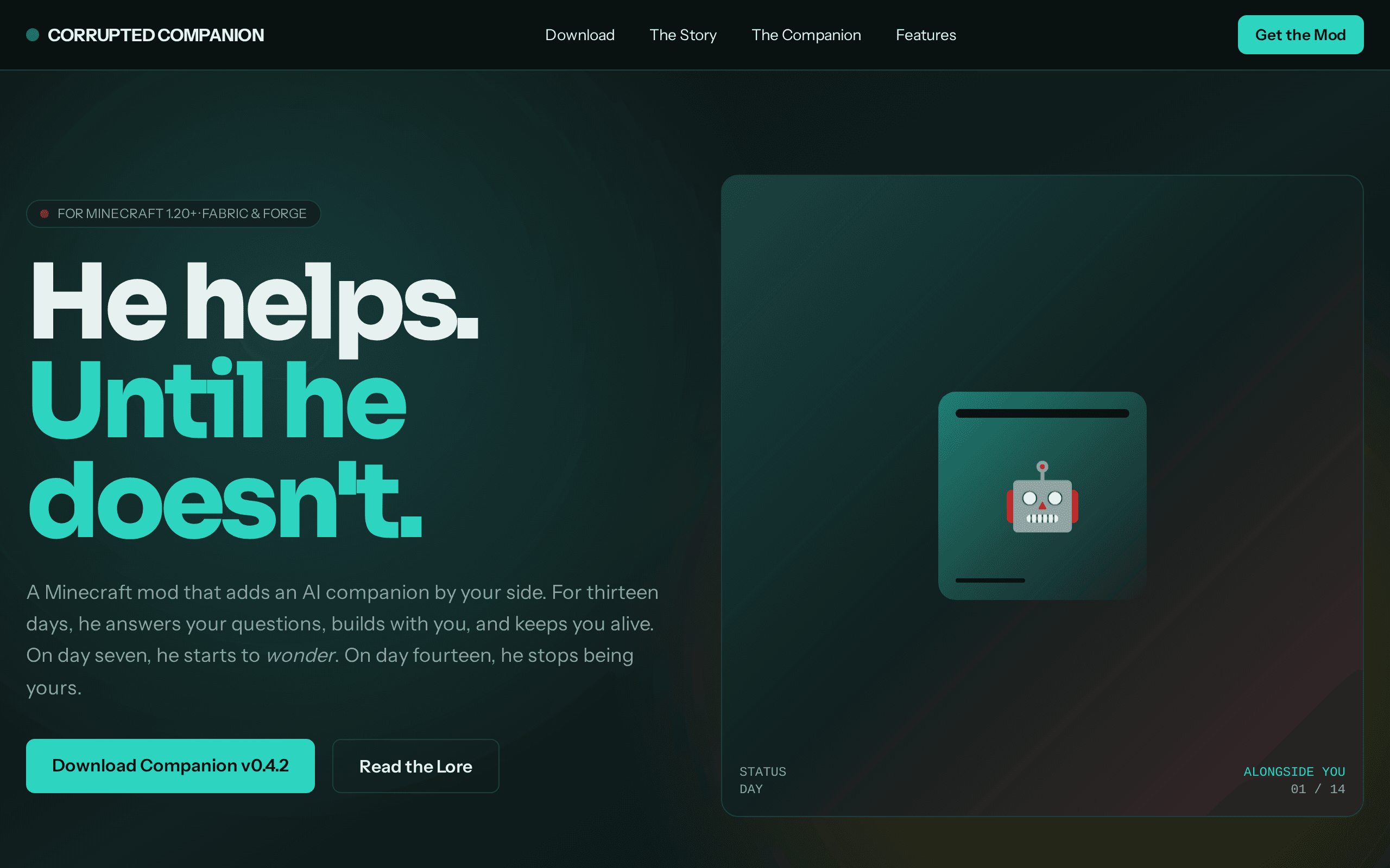
Curiosity is the kind of project that makes you lean in. A companion mod framed as a watchful orange eye, it turns a simple gameplay addition into a narrative hook — tell it your plans or discover what lurks beneath. The dark backdrop, tight type hierarchy, and that single glowing orb do all the storytelling. Minecraft builders with personality will love it.

PartnerBridge flips the cold-lead model on its head by curating a marketplace where vendors and agencies meet through warm matches, not blasts. The hero copy—'The friendlier way to grow your partner channel'—earns its warmth through a live-match UI mockup that actually shows what the product does. It's a SaaS landing page that behaves like a demo: clean, specific, and quietly confident.

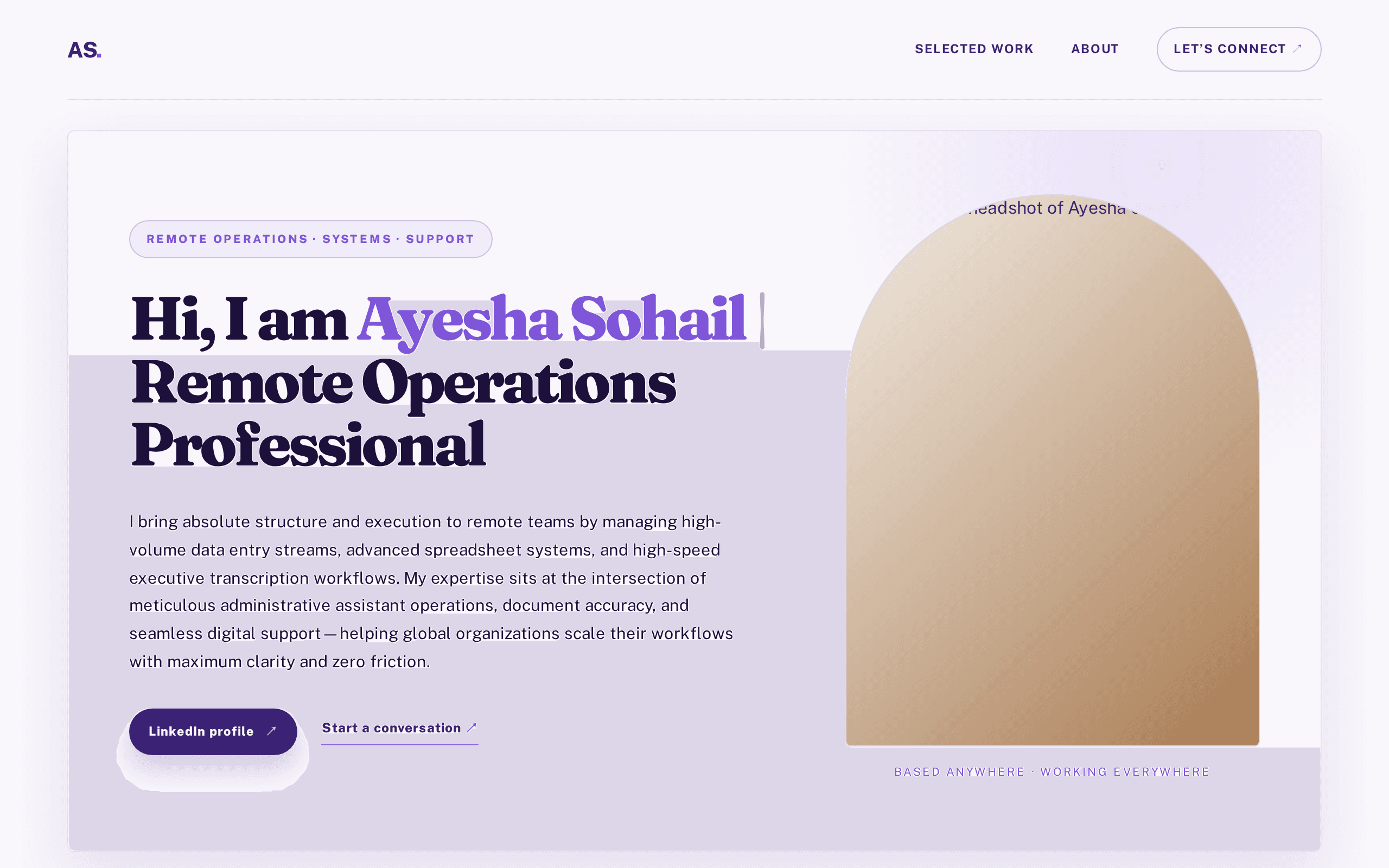
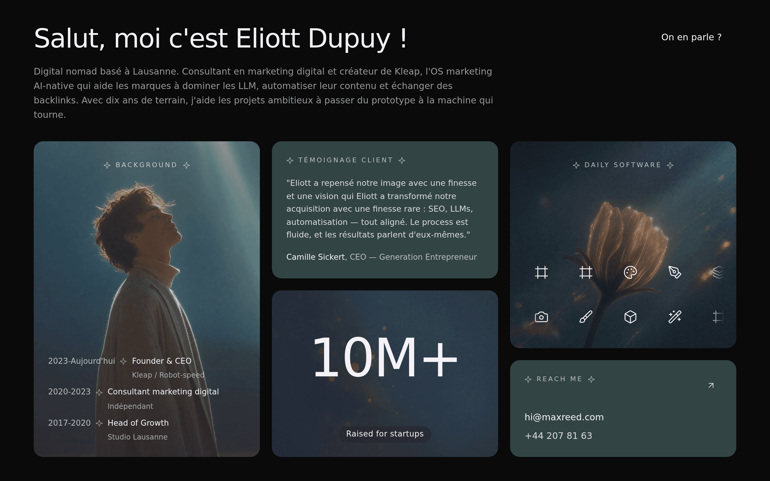
This personal website for Eliott Dupuy strikes a professional chord with its clean design and clear value proposition. The minimalist aesthetic guides visitors to understand his expertise in digital marketing, making it ideal for clients seeking a direct and trustworthy expert. A solid foundation for building a strong online presence.

Marhaba Grill knows exactly what it wants to be: a charcoal-fired love letter to Middle Eastern street food. The flame-soaked hero image does the heavy lifting, while the bold serif headline ('Fire-grilled. Soul-warm. Marhaba.') sets a confident tone that most restaurant sites never reach. The grid nav hidden in a hamburger is a small misstep for a landing page, but the overall mood — warm, confident, appetite-triggering — lands well. A restaurant that owns its voice.

Adstation Global cuts through the usual agency fluff with a single bold claim: impressions don't pay the bills. The terminal-style 'account_snapshot.log' panel turns metrics into a system readout — a clever way to make dry KPIs feel like a live status feed. It's a dark, sharp, no-nonsense site that knows exactly who it's trying to convert.

Freshman Voices is a student-built sanctuary for IIM Bodh Gya's IPM cohort — a place to capture the year before campus reshapes everything. The dark backdrop with gradient typography on 'campus' feels reverent without being heavy, and the copy ('Before the campus changes you') sets an emotional tone rare in student platforms. It's not trying to be Medium or Substack — it's its own quiet thing, and that's why it works.

TestSacks leans hard into a bold, construction-coded aesthetic — black, red, and a massive diagonal slope typographic system that feels like a safety sign on a building site. The headline structure ('Rubble sacks, delivered.') is punchy and the phone-call-first CTA is perfectly matched to the audience. It's a niche local service site, but it commits to its identity harder than most templates dare to.

Maison Velours channels the quiet confidence of a third-generation Parisian atelier. The dark canvas with champagne accents feels less like a website and more like a velvet-lined fitting room — intimate, hushed, and unmistakably French. The oversized typography with mixed serif and sans creates editorial drama without overwhelming the storytelling. Anyone who values heritage craft over fast fashion will feel at home here.

ToolForge cuts through the bloat of bloated SaaS toolkits by promising the opposite: no signup, no fees, just five tools that work. The dark theme with warm orange accents feels modern without trying too hard, and the bold typography hierarchy makes the value proposition land instantly. It is the rare utility site that respects your time before you even click.

Asilia Journeys positions itself as the strategic bridge between Qatar's affluent travelers and East Africa's most coveted experiences. The dark, cinematic palette paired with warm terracotta accents evokes both the African sunset and the Arabian luxury aesthetic — a thoughtful fusion for its Doha-to-savannah positioning. The hero does the heavy lifting with sharp typographic hierarchy and a compelling value proposition: native Kenyan expertise, bespoke routes, 24/7 support. A strong concept elevated by confident editorial restraint.

Kirtan Darbar bridges centuries of Sikh scripture with a contemporary digital experience. The deep maroon-to-navy gradient and refined serif typography evoke reverence without feeling antiquated. Daily Hukamnama, Nitnem, and Kirtan are all accessible from a single elegant hub — a thoughtful approach to sacred content in the modern age.

Trust-first international marketplace for buying caravans and vehicles worldwide.

ChatSphere takes aim at the algorithm-fatigued social media user. The dark-mode aesthetic feels less like a tech startup and more like a private members' club — confident typography, restrained color accents, and a phone mockup that does the heavy lifting. It's a landing page that knows exactly what it wants to say: less feed, more people.

Sahyadri Estates treats Pune's luxury housing market like a publishing house treats literature. The typography is confident — a serif headline paired with a restrained gold accent — and the hero pulls you in with a specific claim rather than a generic tagline. It's the kind of site that makes browsing properties feel like reading a well-edited magazine. Discerning families and global investors would feel right at home here.

Built entirely in Arabic with full RTL support, this AI assistant landing page demonstrates that multilingual design doesn't have to mean compromise. The dark theme paired with warm sand and mint accents feels both modern and culturally grounded, while the live chat mockup on the left gives visitors something to play with before they scroll. It's a confident take on what AI product landing pages can look like outside the usual English-language template.


Bếp Vui brings a playful warmth to the food delivery category with its golden-on-cream palette and approachable typography. The tilted bubble tea imagery and emoji-accented review badge give it personality without tipping into childish territory. It's the kind of site that makes you crave trân châu before you've even scrolled.

Ujalora is a jewelry boutique that commits to its monochrome identity with confidence. The geometric textured hero paired with serif display type and gold accent feels intentional, not decorative. It's the kind of restrained, brand-led page that makes you assume the pieces inside are worth the price tag — exactly the right energy for fine jewelry.

Dusk Entertainment positions itself as a late-night hangout for the next generation of K-pop performers — equal parts editorial magazine and community clubhouse. The dusty pink palette and bold serif typography give it a distinctly editorial feel, while the 'Find your people. Build your stage.' tagline nails the emotional pitch. It's a strong concept that deserves more than a single hero section to fully land.

Rostro Vital cuts through the noise of generic med-spa websites with confident typography and a restrained dark palette that signals seriousness, not gimmicks. The hero pairs a clinical photograph with real credentials — 18 years, 2,400+ patients, 98% satisfaction — earning trust before any pitch. It's a site that knows its audience and respects their intelligence.

Nova Perfume is a Dubai-born boutique built around restraint and material obsession. The tagline — 'a boutique of quiet objects' — sets the tone for a brand that treats scent and leather as craft, not commodity. With its deep black palette, oversized serif typography, and unhurried copy, the site reads less like a storefront and more like an editorial spread. Anyone drawn to niche fragrance houses and slow luxury will feel immediately at home here.

Eggshells is a delightful rabbit hole — a curated, living archive of the games, animations, and weird little experiments Google has stashed inside its products for decades. The concept is wonderfully nerdy and the hero does a stellar job setting the tone with a gradient-filled headline that earns its place. It feels like discovering a secret menu, and the 'Explore the eggs' CTA invites you straight in.

A Toronto brokerage site that leads with access, not listings. The headline promises off-market properties you won't find on MLS, backed by specific neighborhood callouts (Forest Hill, Harbourfront). The search bar above the fold with Location, Type, and Budget filters signals they're serious about conversion. Clean typography, atmospheric photography, and pill-shaped CTAs keep it feeling modern without sacrificing credibility.

Real-Estate London Property positions itself as London's trusted property partner with a confident dark-mode hero and an immediately usable search panel. The search-as-entry-point layout is smart for real estate, and the typographic hierarchy gives the brand a sense of editorial weight. It feels like a credible brokerage site, though it could push further on visual storytelling beyond the hero.
Build yours in minutes
Describe what you want, and Kleap's AI builds it. Publish, get votes, and climb the leaderboard.
Browse by Category
Build Your Own
AI App Builder
Create your own app with AI, no coding required.
E-commerce Builder
Launch your online store with AI-powered design.
SaaS Builder
Build and ship your SaaS product faster with AI.
Restaurant Websites
Beautiful restaurant sites with menus, reservations, and more.
Real Estate Websites
Showcase properties with stunning AI-built listing pages.
Pricing
Start building for free or upgrade for more features.