5 Best Practices for Creating High-Converting Online Forms for Small Businesses

Let's be honest, online forms are the unsung heroes of the digital world.
Think about it—they're the digital handshakes connecting you with your audience, the main way you handle everything from simple contact requests to heavy-duty data collection.
If you're a small business owner, entrepreneur, or freelancer, making a great online form isn't just some tech task to check off a list; it's a core part of your business that hits everything from your lead gen to customer relationships and growth.
A bad form can be a total dead end, frustrating people so much they just give up and leave. That means you're leaving good leads on the table and making a pretty crummy first impression.
The real challenge is making the whole thing feel effortless for the user while still getting the info your business actually needs to grow. It’s all about striking that tricky balance between asking for what you need and showing you respect their time and privacy.
But here's the thing: so many businesses treat forms like an afterthought. They just slap a few fields on a page, call it a day, and then scratch their heads wondering why nobody's converting.
The secret is that a great form is a conversation, not an interrogation. It should guide the user smoothly from start to finish, making them feel understood and valued. This guide is designed to walk you through the best practices for building forms that people actually want to complete.
We’re going to dig into some proven strategies for design, keeping users engaged, and collecting data the right way.
We'll also show you how modern tools—like the AI-powered stuff inside Kleap—make this whole process way easier, letting you build amazing, effective forms without touching a single line of code.
When you finish this guide, you’ll have a clear game plan for turning your forms into one of your business's most powerful tools.
Core Best Practices for Designing Effective Online Forms
Keep Your Forms Concise
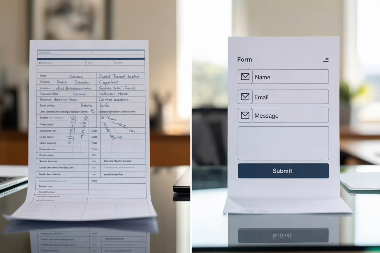
The golden rule of form design is to keep it short. Every single field you add introduces another point of friction, another small hurdle a user has to clear.
As explained in guides from both Glasscubes and F22 Labs, minimizing the number of questions to only what is absolutely necessary is crucial for boosting completion rates. If you're just trying to get leads, you really only need a few key things: a name, an email, and maybe a phone number.
Asking for anything more can feel a bit pushy and scare off potential customers. But what if you really *do* need more info?
When you've got longer things like detailed applications or deep-dive feedback forms, hitting someone with a giant wall of fields is just asking for trouble. So, what's the fix?
Break it up. Multi-step or sectioned forms give people a sense of progress and make the whole thing feel way less overwhelming. It turns a marathon into a few short, easy sprints.

Ask Comfortable and Relevant Questions
You start building trust the moment you start asking questions.
People are getting more and more careful about sharing their personal data, and as Glasscubes points out, they won't hesitate to ditch a form that feels too nosy. Before you even think about adding a field, ask yourself: do I *really* need this information right now?
Is their home address or company size truly essential for a first contact?
Probably not.
The goal is to strike a balance between your business needs and your user’s comfort level. Prioritize questions that your audience is genuinely willing to share at that specific stage of their journey. You can always gather more information later as the relationship develops.
A respectful approach to data collection not only improves form completion but also builds a foundation of trust with your future customers.
Enhancing the User Journey with Smart Form Design
Focus on Input Clarity and Error Management
When it comes to form design, clarity is everything. Your users should never have to guess what you want.
Having clear, simple labels and instructions for every field is non-negotiable, something the experts at F22 Labs really drive home.
Stick to consistent wording and use short placeholder text (the grayed-out text inside the box) to give people a hint without making the page look messy.
Think of it like having a friendly guide right there with them, making sure they get every step.
Look, mistakes are going to happen.
It's how you handle them that shapes the whole experience. Don't just flash a frustrating "Error" message—tell people what went wrong, but be nice about it.
As folks from Adobe Business and Formsort point out, telling someone 'Please enter a valid email address' is a million times more helpful than just highlighting a field in red with zero explanation. This simple approach helps people fix their mistakes without getting frustrated and giving up.

Optimize Field Design and Flow
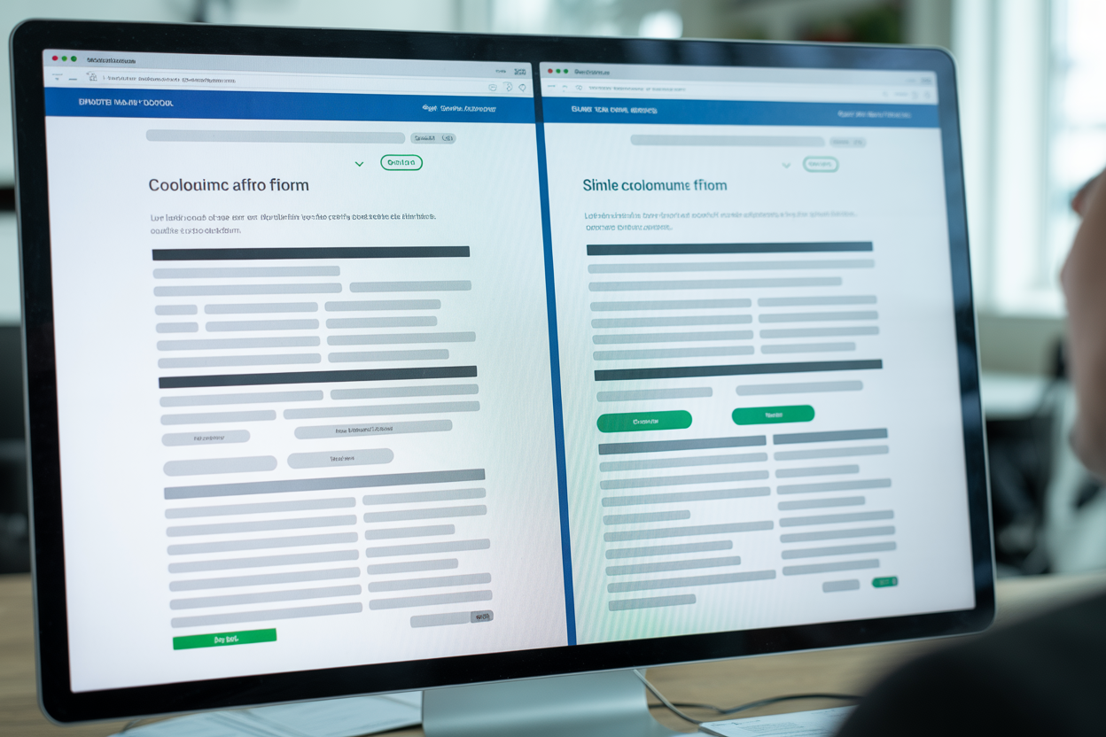
How your form looks has a massive impact on how easy it is for people to fill out. Time and again, research from places like Adobe Business shows that single-column layouts are just plain easier for people to scan and complete.
Our eyes naturally want to move down the page, so following one logical path is way simpler than jumping around a scattered, multi-column grid.
It removes ambiguity and helps users build momentum as they progress through the form.
You also need to be explicit about what is required versus what is optional.
And please, clearly mark your required fields with an asterisk or the word “required.” It gets rid of the guesswork and lets people know what to expect. Want to make things even smoother?
Use standard field labels like 'name' and 'email' so that browser autofill can do its magic. For those fields that might feel a little sensitive, like a phone number, think about adding a little info icon that pops up to explain exactly why you're asking for it.
Honestly, that small bit of transparency goes a long way in building trust and making people more willing to share their info.
Driving User Engagement with Interactive Forms
Mix Input Types and Use a Conversational Tone
Staring at a page full of empty text boxes is monotonous. To keep people engaged, it's smart to mix up your input types.
As the folks at F22 Labs recommend, try using a mix of text boxes for open answers, dropdown menus for longer lists, and radio buttons when they can only pick one thing. This variety doesn't just make the form look more interesting—it actually makes it easier for the user to fill out.
Your words matter just as much as your form fields. I read on Formsort that using a friendly, conversational tone can turn a cold questionnaire into a much more pleasant chat. Instead of a button that says "Submit Data," try something like "Get Your Free Quote." And for those longer forms, asking just one or two related questions per page feels more like a friendly chat and less like a pop quiz.

Implement User-Friendly Features
Let's be real: nothing is more frustrating than losing all your progress on a long form. A great way to stop this from happening is to add an auto-save feature—a tip I picked up from F22 Labs. This lets people finish longer forms in a few different sittings without worrying about losing their work, which is a lifesaver for detailed applications or surveys.
That call-to-action (CTA) button is the last step on their journey, so you've got to make it count. Make sure it stands out and uses inviting, action-focused text that tells people exactly what's going to happen next. Words like "Get Started" or "Submit Feedback" are just so much more compelling than a boring old "Submit." Want to give users another little push?
Use visual feedback like a progress bar.
According to Formsort, showing people how close they are to the finish line gives them a nice psychological boost and makes them want to finish.
Essential Form Types for Small Business Success
For any small business, some forms are just more important than others. You've got a few essential types that are key to streamlining how you work and actually driving growth. Knowing which ones to prioritize can make a significant difference in how you interact with your customers and manage your workflow.
Let's look at the foundational forms every entrepreneur and freelancer should have on their website.
Contact Forms for Streamlined Communication
A contact form is the digital front door to your business.
It’s often the first point of interaction for a potential client.
As the team at Cognito Forms mentions, these are crucial for streamlining communication and getting leads without putting your email address out there for spambots to find. And if you connect it to some automation software, you can fire off an instant confirmation email, letting people know you got their message and will get back to them soon. It's a simple step that makes you look more professional and improves the customer experience right from the get-go.
Lead Capture Forms for Sales Opportunities
A contact form is great for general questions, sure, but a lead capture form has one job: turning website visitors into actual sales opportunities. These forms are usually short and to the point, designed to grab just enough info to kick off a sales conversation. The whole point is to generate leads.
When you hook these forms up to your CRM or email marketing tools, you can automatically start nurturing those new leads—sending them helpful content and guiding them through your sales funnel without you having to lift a finger.
Feedback and Testimonial Forms
How do you know what you’re doing right and where you can improve?
You ask.
Feedback and testimonial forms are invaluable tools for gathering customer satisfaction data.
You can use them to collect direct input on your services or to gather glowing reviews that can be used as social proof on your website.
As Cognito Forms suggests, this data is gold for both service improvement and marketing, helping you build a stronger brand reputation based on real customer experiences.
How Kleap Helps You Build Powerful Online Forms
Understanding all these best practices is one thing but implementing them is another. This is where a powerful website builder like Kleap comes into play.
You shouldn't need to be a coding expert or a UX designer to create effective forms for lead generation and data collection.
Kleap’s platform is built with these exact challenges in mind, providing small businesses and entrepreneurs with the tools to build professional, high-converting forms effortlessly.

User-Friendly Drag and Drop Building
The days of wrestling with complicated code just to build a simple form are over. Kleap gives you an easy-to-use drag-and-drop builder that makes creating a form feel like a piece of cake.
You can visually construct your form by dragging different field types, like text boxes, dropdowns, and checkboxes, directly onto the page. This means you can build and deploy a fully functional contact form or lead capture form in minutes, not hours, freeing you up to focus on other parts of your business.
Customization and Powerful Integrations
Your business is unique, and your forms should be too. With Kleap, you can completely customize your forms so they match your brand and do exactly what you need them to do. Whether you're making a simple contact form or a complex, multi-step survey, you're in full control of all the fields, labels, and styling.
What's even better is that Kleap probably connects with the business tools you already use.
You can link your forms right up to email platforms, CRMs, and analytics software to build a smooth workflow for handling your data and following up with every single lead.
Mobile Optimization and Security by Default
Let's face it, a huge chunk of your audience is going to be on their phones when they visit your site.
And if a form is a pain to use on a smartphone, it's a form that's not getting filled out.
Period. Kleap makes sure every form you create is fully responsive, so it'll look and work great on desktops, tablets, and phones.
On top of that, data security is a huge deal. With built-in features to protect user data and keep you in line with privacy rules like GDPR, you can collect info with total confidence, knowing that both your business and your customers are safe.
At the end of the day, a form is so much more than just a box for collecting data. It's a critical moment in your customer's journey—a direct conversation that can either build a relationship or completely break it.
By really leaning into the best practices we've talked about, you can turn your forms from a chore into a total strategic advantage. Keeping things short, clear, and user-friendly won't just get more people to finish your forms—it also sends a clear message that you respect their time and actually value what they have to say. It's all the little details—like a helpful error message or a clean single-column layout—that add up to create a smooth, positive experience for anyone who interacts with your brand online.
And the good news?
You don’t have to be a tech wizard to pull this off.
You don’t have to be a tech wizard to achieve this. The whole point of modern platforms is to make sophisticated tools accessible.
With a solution like Kleap, all these principles are baked right into the platform.
Its AI-powered website builder and intuitive form creation tools empower entrepreneurs, freelancers, and small business owners to implement these professional strategies without any technical headaches. This allows you to focus on what you do best while your website works tirelessly in the background, capturing leads and gathering feedback.
Something that used to be a complicated headache is now totally straightforward, freeing you up to build the powerful connections your business needs to grow.
So, are you ready to turn your website's forms from a simple tool into a real engine for growth?
Stop letting clunky forms scare away potential customers. Give Kleap a try and see for yourself how our AI-powered website builder makes it ridiculously easy to create beautiful, effective forms that actually convert—all in just minutes. Start getting more leads and better data today.
Ready to build your website?
Start creating your professional website with AI in minutes. No coding required.
Get Started Free

