Build a Personalized Letter Type Generator: 5 Steps for Brand Consistency
When you think about your brand's visual identity, realize it's way more than just a logo.
It's that gut feeling someone gets on your website, how they spot you instantly in a busy social feed, and the quiet vibe your marketing gives off.
A massive piece of that puzzle is your typography. That’s where this idea of a personalized 'letter type' generator really comes in handy.
It's not some magic button that creates the perfect font.
It’s more of a creative workflow you can follow to build a typographic style that nobody else has. Following this process helps you whip up custom fonts and letter styles that capture your brand's personality, which is a huge boost for your website's overall look and feel.
Think about the most famous brands out there. You can probably recognize a bunch of them just from their typeface, right? That kind of unique look doesn't just happen by luck.
It comes from a really thoughtful plan to build a solid typographic identity. In this guide, we'll walk you through the exact steps to set up your own 'letter type' generator workflow. We’ll dive into figuring out your brand's voice, checking out different typographies, using some awesome design tools, and adding your own personal touch to every last detail.
By the end, you’ll have a clear roadmap for developing a letter style that is not just beautiful but also works hard for your business. This ensures your visual identity is cohesive, memorable, and truly one-of-a-kind. It's about turning letters on a page into a powerful asset for your brand.
What you'll learn
- Define Your Brand's Core Identity First
- Researching Typography and Lettermark Styles
- Choosing Your Typography Fundamentals
- The Best Tools for Your Letter Type Generator Journey
- Personalizing Your Custom Fonts to Perfection
Define Your Brand's Core Identity First
Before you even think about fonts or design software, you have to look inward.
You can't start creating a custom letter style until you truly understand what your brand is all about. So, what are you all about? You need to nail down exactly what makes your brand tick.
Are you playful and full of energy, or more on the elegant and sophisticated side?
Maybe you’re minimalist and modern, or even rugged and traditional. Jot these words down; they're going to be your north star.
Getting this groundwork done first means every visual choice you make down the line will have a real purpose behind it.
Once you’ve got those keywords, start thinking about the feeling you want people to get. This is where you turn those big ideas into actual design decisions.
Design resources like Looka and Logopony emphasize the importance of deciding whether you prefer a vibe that’s structured and geometric or one that’s more artistic and handwritten. A tech startup, for instance, would probably go for clean, geometric lines to convey a vibe of innovation and efficiency. On the flip side, a local bakery would likely choose a handwritten style to feel warm and signal that handcrafted quality.
Making this call is a huge deal because it really sets the mood for everything you do with your typography.
You can't skip this part.
It’s like trying to build a house without a blueprint.
Sure, you might end up with something that looks okay. However, it won't be solid or do the job you need it to do.
Your chosen letter style has a job to do, and that job is to communicate your brand’s personality instantly. A strong, minimalist letter might convey confidence, while a flowing script could signal creativity and approachability. Taking the time to codify your brand’s personality ensures every curve and line of your typography works to tell the right story.
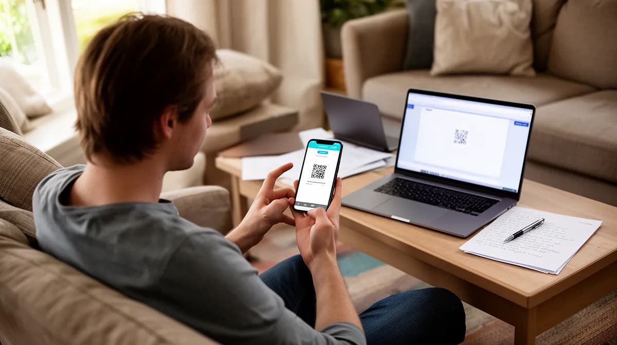
Try it — build your site while you read
Describe what you want and get a live, publishable site in seconds. Free to start, no code.
Join 200,000+ makers building real websites with Kleap.
Researching Typography and Lettermark Styles
Once you know who you are as a brand, it's time to see how others express themselves through letters.
A fantastic place to start is by looking at lettermark logos. You know, the ones built from a single letter or initials?
They're basically the masters of saying a lot with typography.
Think of the two C's in Chanel, the straightforward 'CNN' logo, or the famous 'LV' from Louis Vuitton. Every single one of them tells you a story about luxury, authority, or heritage, just with its shape, thickness, and style.
Breaking down these examples, something that resources like Logopony suggest, shows you how much personality you can cram into just a couple of letters.
It's also incredibly important to look at what's happening in your own industry. You want your brand to stand out, but you also need it to feel relevant. Researching current logo trends, as highlighted by design experts, can help you strike that balance.
See what your competitors are doing with their typography. Are they all using bold, sans-serif fonts?
Maybe there’s an opportunity for you to use an elegant serif or a unique script to differentiate yourself. The goal isn’t to copy them, but to understand the visual conversation happening in your space so you can add your own unique voice.
This research phase is all about gathering inspiration and context. Create a mood board.
Start saving images of fonts, logos, and letter styles that just feel right and align with your brand's personality keywords. Pretty soon, you'll start to notice patterns emerging that will point you toward the kind of letter style you should be aiming for.
This collection of images will be a lifesaver when you get to the part where you're choosing and tweaking your typography, and it helps ensure your final design is both original and smart, something you'll see in guides from places like Canva.

Choosing Your Typography Fundamentals
Alright, with your research done and your brand identity figured out, it's time to start making some real decisions about your typography. The first move is to pick a typography family that matches your brand’s personality. You've got a few main types, and each one has its own vibe.
Take serif fonts, for example.
Those little feet on the letters?
They tend to feel traditional, trustworthy, and professional. Think about big universities or old-school banks. They just feel solid and dependable, right?
Then you have sans-serif fonts, which don't have those little strokes. That gives them a super clean, modern, and friendly look.
They’re what you see all over the place with tech companies and modern brands that want to seem fresh and to the point. And of course, there are script or handwritten fonts.
These are amazing for showing off creativity, friendliness, and a personal touch (perfect for artists, coaches, or any brand that just wants to feel more human). Guides from both Logopony and Canva will tell you the same thing: picking the right font family is the first big move in crafting your brand's unique voice.
But choosing a family is just the start. The real magic happens in the details.
You should consider customizations that will make the font truly your own. Look at things like letter spacing, also known as kerning, which is the space between individual letters. Adjusting it can dramatically change the mood of a word.
You can also explore ligatures, which are special characters that combine two or more letters into a single, graceful glyph. And don't forget about case style.
Using all uppercase can feel bold and authoritative, while all lowercase can feel casual and approachable.
These subtle tweaks, recommended by resources like Looka, are what elevate a standard font into a piece of custom brand typography.
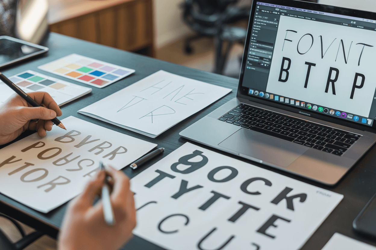
The Best Tools for Your Letter Type Generator Journey
You don't need to be a master typographer to create a unique letter style.
You don't have to go it alone.
These days, there are some incredible tools out there that use AI and can pretty much act as your personal font generator.
These tools give you both the structure and the creative freedom you need to make your vision a reality. For instance, a tool like Logo.com is a fantastic place to start exploring, as it lets you play around with tons of fonts, add symbols, and tweak layouts based on your input.
If you want something fast that you can still tweak a lot, Logopony is great because it specializes in creating lettermark logos in no time. It produces designs that fit your brand's vibe and then makes it super simple to adjust them until you get them just right.
In a similar way, Looka has a cool interactive process where you tell it your style preferences, colors, and symbols. It then generates a whole bunch of different mockups for you to see. From there, it lets you get really granular and customize every little thing, from the thickness of the font to the spacing between letters.

Now, if you want a ton of creative freedom and the ability to work with a team, Canva is an absolute powerhouse. It has a gigantic library of pro-level typography logo templates that you can take and make completely your own. You can adjust the fonts, colors, backgrounds, and just about anything else, and you can even have your team jump in and work on it with you.
And for anyone who's into what AI can do, LogoAI features a smart engine that creates some really impressive text effects and font styles, everything from handwritten and elegant to futuristic and high-energy, and you can change it all with just one click.
The key is to use these tools not as a final answer, but as a robust part of your creative process. They are your digital sketchbook. Use them to test the ideas from your research, play with different font pairings, and see your brand attributes come to life.
By leveraging these platforms, you are effectively creating a workflow that functions as your own personalized letter type generator, adapting and refining until you land on a style that is perfectly aligned with your brand.
Personalizing Your Custom Fonts to Perfection
Using a template or a generated font is a great start, but true brand originality comes from personalization. This is where you transform a good design into a great one that is unmistakably yours.
One powerful way to do this is by modifying existing fonts with unique flourishes. You could round the sharp edges of a modern sans-serif to make it feel friendlier or add subtle geometric elements to a classic serif to give it a contemporary twist.
Even playing around with the empty space inside a letter can lead to a really clever and unforgettable look.
Color is another huge piece of the puzzle.
The colors you pick will directly affect how people feel when they see your brand.
Like the branding pros at Looka point out, bold, high-contrast colors can make things feel energetic and exciting, while softer, muted colors tend to give off a vibe of luxury and class. Fresh, earthy colors could be the perfect fit for a wellness or eco-brand. Getting your website's color scheme and your typography to work well together is what creates that seamless, put-together look.
Don't just think about the letters themselves; think about how you arrange them. Go ahead and get creative with it.
Try weaving or overlapping letters to achieve a more connected, custom feel.
You could even arrange initials in a circle or a starburst pattern to create a cool, dynamic seal. Creative platforms like Canva show that these kinds of out-of-the-box arrangements can make your branding much more distinctive.
It’s this kind of deep customization that takes your typography from just a font you picked to a genuine piece of custom art for your brand.
Integrating Brand Assets and Key Symbols
Here's a pro move: your letter style doesn't have to stand alone.
A really smart way to make it even more unique is to incorporate other brand-specific elements right into the design. Think about tucking a small, recognizable icon or symbol somewhere in or around the letters.
A coffee brand, for instance, might cleverly hide a little coffee bean shape in the empty part of the letter 'B.' Or a tech company could work a cool circuit board pattern into the texture of its initials.
This trick, which design platforms like Logo.com often showcase, connects your typography directly back to what your business is all about. It adds another layer of meaning and makes your visual identity stick in people's minds. It's a smart way to tell a bigger story without making things look cluttered.
The trick is to ensure it looks natural and as if you meant to do it, not like you just slapped it on there. Whatever you add should work with the letters, not fight them for the spotlight.
As you start adding these cool little details, you absolutely have to think about how it's going to scale. This is a huge point that both Looka and Canva always emphasize.
That gorgeous, detailed letter design has to look just as crisp when it's a tiny icon in a browser tab as it does when blown up on a giant banner.
You must ensure all those extra icons, symbols, and textures are still clear and readable no matter where they show up. Let's be real, a design that becomes blurry or unreadable when you shrink it down is a bust.
So test it everywhere, at every size.

The Crucial Step of Testing and Previews
This is huge: you might think your design looks perfect on your computer, but the real test is seeing it in the real world. Checking out your personalized letter style in all kinds of real-world situations is a step you just can't afford to skip.
You need to see how it looks on items like t-shirts and mug mockups, what it does on a website banner, and if it's still recognizable as a tiny social media profile picture. This is the only way to be sure it's versatile and that people will recognize it everywhere they see your brand.
Really look at how the design interacts with different backgrounds. Does it remain readable and punchy on both light and dark colors? What happens when you place it on top of a busy photo?
As platforms like Canva mention, many design tools have mockup generators built right in that make this whole process a breeze. Use them frequently.
This is often where you catch problems you never saw coming, like a skinny line completely vanishing or a color combination looking strange.
Last but not least, before you commit, get some feedback. Show your favorite designs to your team, stakeholders, or even a handful of potential customers.
Getting a fresh pair of eyes on it can reveal things you completely missed because you've been staring at it for so long. Ask them direct questions like, 'What three words pop into your head when you see this?' or 'Which one of these makes you feel like you can trust us more?'
This kind of feedback, which guidance from Looka highly recommends, is invaluable for ensuring your design is actually sending the right message.
Exporting and Documenting Your New Brand Typography
So you've nailed down your design after all that testing and feedback. The last piece of the puzzle is getting it ready for prime time. That means you need to export your custom letter style in all the different file formats you'll need.
You’ll need different file types for different jobs. For instance, you absolutely need an SVG (Scalable Vector Graphic) because you can resize it to any dimension without it becoming blurry, which is perfect for logos and icons.
You'll also want to grab raster files like a PNG with a transparent background and a JPG for everyday web use, just as platforms such as Canva outline.
Once your files are good to go, you're not quite done.
The smartest, most professional thing you can do now is to write all this down in a brand style guide.
Think of this document as the official rulebook for your brand's look and feel.
It needs to spell out exactly which fonts to use, the specific logo style, all the color codes, spacing rules, and how the logo should (and shouldn't) be used in different situations. This guide keeps your brand looking consistent, no matter who's working on your marketing, whether it's a new hire or a freelance designer.
This documentation will keep your brand identity strong and consistent as time goes on. Branding experts at places like Logopony will tell you that a style guide stops your visual identity from getting watered down or messy as your company gets bigger.
It's a living document that turns your whole team into brand champions, making sure everything they create reinforces that awesome, unique identity you've worked so hard to build. It's the very last step that turns all your creative work into a real, lasting asset for your brand.
Building a Lasting Brand with Custom Fonts
So, what's the bottom line?
Creating a personalized 'letter type' generator isn't a one-off task; it's all about building a smart, repeatable process you can use again and again.
It's a journey that starts with some soul-searching and ends with something real, ensuring your typography isn't just a finishing touch but a true cornerstone of who you are. When you pin down your personality, check out what everyone else is doing, and use the right tools, you create a visual language that says a ton about you.
A couple of big takeaways should be pretty clear by now.
First, simple, minimalist lettermarks often hit the hardest because they're easy to remember and super flexible, a point the experts at Logopony make all the time. Plus, real brand power often comes from digging in and doing that extra customization.
Moreover, true brand value is often built through advanced customization. Using creative techniques like negative space or abstract features can make your brand appear more innovative and memorable, as studies show.
This dedication to uniqueness separates good brands from great ones.
The choice of color and font remains one of the primary drivers of emotional response and brand differentiation. Your decisions in these areas directly influence how customers feel about your brand before they even read a single word of your copy.
A thoughtfully chosen website font acts as a quiet ambassador for everything your brand stands for.
At the end of the day, having a strong typographic identity gives you a serious edge over the competition. It ensures people know it's you in a split second and that your brand's unique personality shines through.
Here at Kleap, we understand how powerful a strong brand can be. The team built the platform to help creators and entrepreneurs put together a killer online presence, and we know a unique visual identity is a huge piece of that. If you're ready to build a site that showcases your new brand typography and really helps you connect with your audience, you should check out what Kleap has to offer.
We'll handle the platform; you bring the vision.