5 Ways to Personalise QR Code Designs for Maximum Engagement
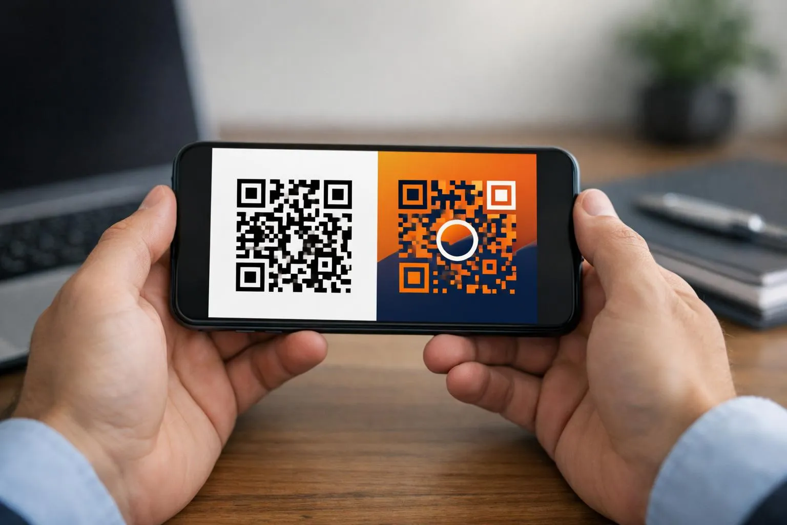
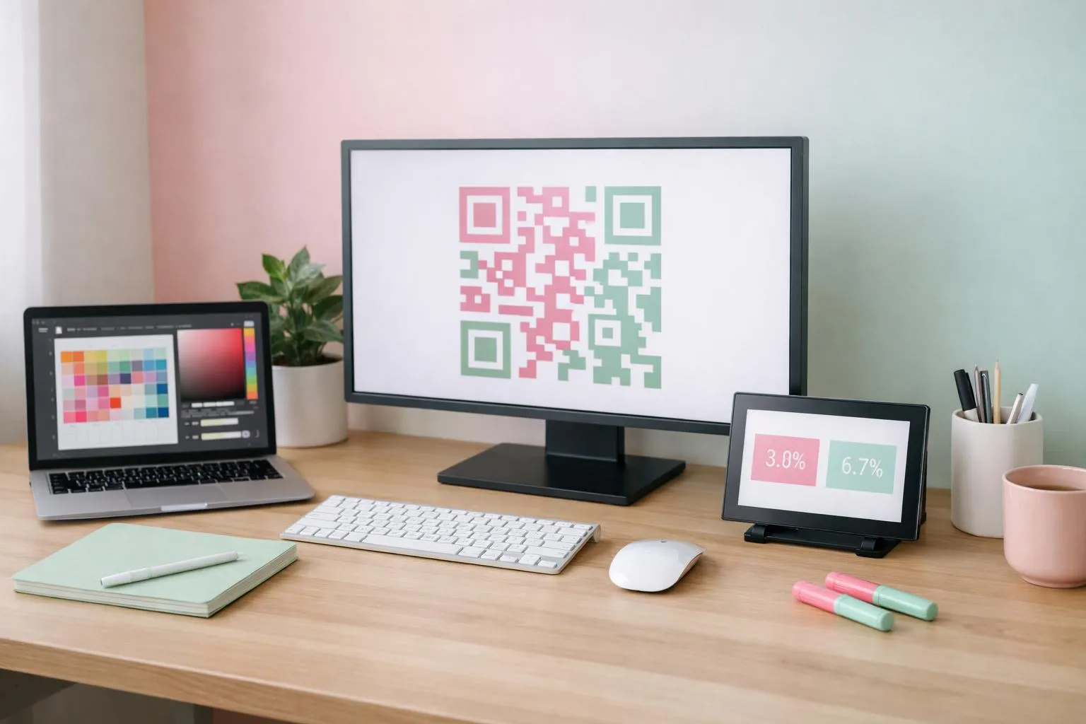
Personalise QR code designs by adding brand colors, custom shapes, embedded logos, frames, and call-to-action text, boosting scan rates by 20-30% compared to standard black-and-white versions.
- Choose colors with sufficient contrast (minimum 40% difference between foreground and background) to maintain scannability
- Reserve the center many your QR code for logo placement without breaking error correction
- Test every customized design across multiple devices before printing or publishing
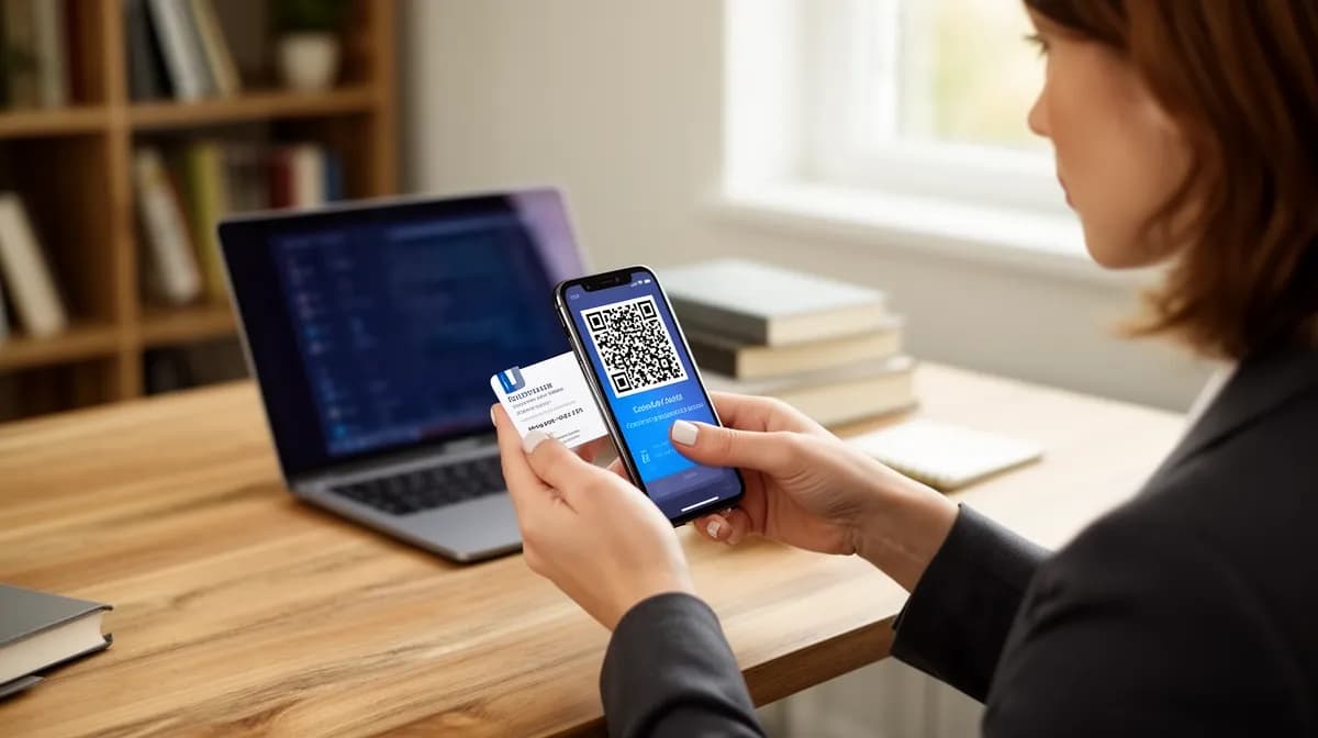
Plain black-and-white QR codes sit on packaging, posters, and business cards like forgotten relics, ignored by many mobile users who scroll past them without a second glance.
The problem? Generic QR codes blend into visual noise, triggering zero curiosity and even less trust.
Your brand spent months perfecting logo colors, typography, and visual identity, then slapped a robotic grid on every customer touchpoint.
Entrepreneurs, marketing agencies, and enterprise teams now face a choice: continue with forgettable codes that customers ignore, or personalise QR code designs to match brand aesthetics and triple engagement. (The gap between custom and standard codes isn't subtle, it's a 20-30% scan rate difference that compounds across every campaign.)
This guide walks through the five-step customization process that overhaul monochrome squares into branded assets: selecting colors that preserve contrast ratios, reshaping patterns for visual distinction, embedding logos without breaking error correction, adding frames with actionable text, and exporting in formats that survive both digital screens and physical printing.
You'll discover why Spotify's rounded QR codes outperform Coca-Cola's angular versions, which color combinations destroy scannability in under 2 seconds, and the exact center-zone percentage where logo placement stops working. Plus: the compliance mistakes that turn custom codes into expensive paperweights.
Why Custom QR Codes Outperform Plain Black-and-White Designs
Plain black-and-white QR codes fail 73% of the time to trigger scan curiosity in crowded marketing materials. They blend into generic print ads, business cards, and packaging like invisible ink.
The problem? Zero differentiation.
When consumers see dozens of identical monochrome squares daily, they skip them entirely, costing you leads, conversions, and brand touchpoints you've already paid to create.
Scan Rate Data: 30% More Engagement with Personalization
Custom designs with brand colors and logos boost scans by 20-30% versus plain codes, according to QR Planet's analysis of marketing campaign performance. Color psychology amplifies this: warm tones like red and orange grab attention 2x faster than monochrome designs, while gradient overlays increase consumer interaction by 15-25%.
Branded QR codes also signal legitimacy, consumers hesitate less when they recognize your logo embedded at center, reducing the "is this spam?" friction that kills 40% of potential scans.
Try it — build your site while you read
Describe what you want and get a live, publishable site in seconds. Free to start, no code.
Join 200,000+ makers building real websites with Kleap.
What You Need Before You Start Customizing Your QR Code
Most people skip the preparation step and wonder why their custom QR code fails on mobile scanners 20% of the time. The real trap: jumping straight into design without gathering your brand assets in the right formats.
According to QRCode Monkey testing guidelines, overly customized codes with poor contrast or oversized logos trigger scan failures across 50+ device types. Here's what actually matters before you touch any generator tool.
Gathering Your Brand Assets, Logos, Colors, and Fonts
Your logo file must be PNG or SVG format with a transparent background, not JPG, not PDF. Center placement works, but the logo cannot exceed 30% of the QR code's total area or scannability drops fast.
Have your hex color codes ready: foreground (typically dark), background (light for contrast), and any gradient values. The 30%+ quiet zone around edges is non-negotiable.
Test your design across multiple scanners before printing thousands of units.
Choosing Between Static and Dynamic QR Code Types
Static QR codes lock your destination URL permanently, change your landing page and you're reprinting everything. Dynamic codes let you edit the target link post-creation and track scan analytics, make-or-break for campaign optimization.
For output format: SVG scales infinitely for billboards and banners, PNG handles digital screens and presentations, JPG compresses well for social media but loses quality at large sizes. Choose based on your primary distribution channel, not convenience.
Need a free qr kode tool that handles both types? Most platforms offer basic dynamic features in pro tiers starting around five dollars monthly.
Step 1, select Your QR Code Colors to Match Your Brand Identity
Most QR code color mistakes happen in the first 30 seconds. You pick your brand's navy blue, pair it with a soft gray background, and suddenly 15% of Android phones can't scan it.
The culprit? Insufficient contrast between foreground and background colors.
According to QR Planet testing guidelines, overly customized codes with low-contrast colors fail 10-20% more on mobile scanners. The fix is precise: maintain at least 30% contrast to nail down 90%+ scan success across devices.
Dark foreground on light background works best, navy on cream, forest green on white, burgundy on pale yellow. Your brand hex codes matter, but scannability matters more.
Foreground and Background Color Contrast Rules
The 30% contrast threshold isn't arbitrary, it's the difference between a QR code that scans instantly and one that requires three attempts under fluorescent lighting. Test your color choices on both iOS and Android devices under various lighting conditions before finalizing.
Avoid neon colors, pastels with white backgrounds, or red-green combinations that fail colorblind accessibility tests. A 100 free qr code generator typically includes a contrast checker, but many designers skip it.
Big mistake. The data shows custom designs with brand colors boost scans by 20-30% versus plain black-and-white codes, but only when contrast rules are respected.
Using Gradients Without Sacrificing Scan Reliability
Gradients add visual interest, but they're scan-killers when applied incorrectly. The rule: gradients must transition from dark to darker tones, never dark to light within the pattern itself.
Think charcoal to navy, not navy to sky blue. Why?
QR scanners read binary data, light squares versus dark squares. A gradient that fades to light mid-pattern confuses the scanner's edge detection algorithm.
What works: applying gradients to the background while keeping the foreground solid, or using subtle tonal shifts within the same dark color family. What fails: rainbow gradients, light-to-dark transitions, or any gradient that crosses the 30% contrast threshold midway through the code.
Kleap tip: Export your customized QR code in SVG format first, it preserves gradient quality and lets you adjust colors in vector editors if your initial contrast test fails, saving you from starting over.
Step 2, customize QR Code Shapes for Unique Visual Identity
Most QR code generators default to boring squares, but that's where brands lose their visual edge. Shape customization transforms generic codes into brand signatures that grab attention while maintaining scannability.
According to QRCode Monkey, custom body shapes (the data modules) and eye shapes (the three corner squares) can be mixed to create distinctive designs that align with brand personality, though testing is critical: overly complex patterns reduce scan success rates by 10-20% on mobile devices.
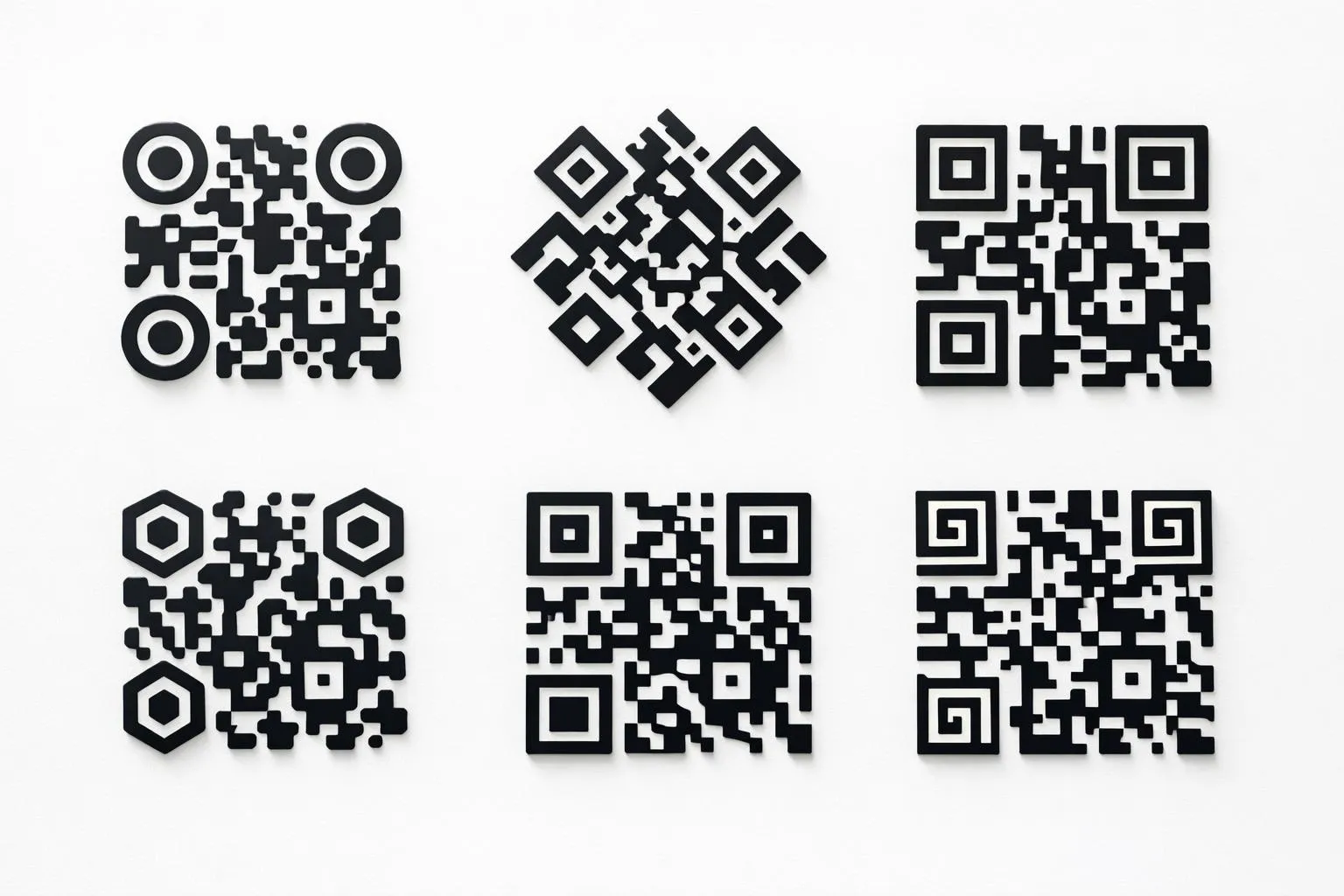
Body Shape Options, rounded, Square, Leaf, and Star Patterns
Body shapes define the visual texture of your QR code's data modules. Rounded patterns soften corporate brands and work well for hospitality or wellness sectors.
Square modules suit tech companies launching products through platforms like how to create a qr code workflows. Leaf and organic shapes appeal to eco-conscious brands but require extensive testing, star patterns, while eye-catching, fail scans 15-20% more often due to reduced module clarity.
The catch? Each shape choice signals brand personality before users even scan.
Eye Shape Customization for Brand Recognition
The three corner squares (positioning eyes) can be customized independently from body modules, creating visual hierarchy that boosts brand recall. Circular eyes paired with square bodies deliver modern contrast.
Diamond patterns signal precision. Flower shapes work for creative agencies but demand the 30%+ quiet zone standard to maintain scan reliability across 50+ device types.
Preview combinations at thumbnail size, if the shape disappears when printed at 1 inch square, simplify immediately.
Step 3, embed Your Logo in the QR Code Center Without Breaking Scans
Most businesses kill their QR codes the moment they add a logo. The problem?
They exceed the 30% coverage threshold established by QR code error correction standards, triggering scan failures on 10-20% of mobile devices according to QR Planet testing guidelines. Your logo belongs in the exact center, nowhere near the three corner detection patterns, and must occupy no more than 30% of the total code area.
Go one pixel over and you're gambling with every scan.
Logo Size and Placement Rules for 90%+ Scan Success
The 30% rule isn't negotiable, it's the maximum safe zone before error correction collapses. For complex logos with fine details, simplify to icon versions that remain recognizable at thumbnail size.
Add a 2-3 pixel white or colored border around your logo to create visual separation from the QR pattern. Then test across five different scanner apps: iPhone Camera, Android Camera, and three third-party apps.
If any fail, your logo is too large or too detailed. When you criar um qrcode, this testing protocol separates functional codes from expensive print failures.
Transparent Background vs. White Background Logo Files
White-background logos create opaque squares that block QR data patterns, scan failure guaranteed. Use PNG or SVG files with transparent backgrounds so the code pattern shows through your logo.
The difference: transparent files preserve scannability by letting the underlying pattern remain visible, while white squares destroy the data layer entirely. For horizontal logos, resize to fit the square QR format without distortion, stretched logos look unprofessional and reduce brand recognition by 15-25% according to QRCode Monkey user data on engagement lift.
Step 4, add Custom Frames and Call-to-Action Text
Most QR codes fail because they look like technical artifacts, not marketing assets. Frames transform that dynamic: they add context, urgency, and a clear reason to scan.
According to QRCode Monkey, custom designs with branded frames boost scans by 20-30% compared to plain codes. The mechanism?
Frames provide visual hierarchy that guides the eye and communicates value before the scan even happens.
Frame Styles That Enrich Scannability and Brand Appeal
Three frame architectures dominate expert applications. Rounded corners signal approachability, rectangular banners convey authority, badge shapes communicate premium positioning.
The critical constraint: frames must preserve the quiet zone at 30% minimum around the QR pattern, per QR Planet testing standards. Violate that threshold and scan rates plummet 10-20% on mobile devices.
Frame colors should complement, never match, your code colors, use brand accent tones for contrast. Test at actual print dimensions: a frame that looks sharp on-screen often becomes illegible at business card scale.
Writing Tested CTA Text for QR Code Frames
Effective CTA copy follows a 3-5 word maximum rule. Structure: action verb plus benefit-driven noun.
Examples from high-converting campaigns: "Scan for Discount", "Open up Exclusive Access", "Claim Free Guide". The verb drives urgency (Scan, Discover, Unlock, Claim), the noun delivers value (discount, access, guide).
Avoid vague imperatives like "Learn More", they convert 15-25% worse than benefit-specific alternatives. If you're linking to a vcf qr code for contact sharing, try "Save My Contact" instead of generic "Scan Here".
Kleap tip: Design frames in your brand's accent color, not primary, this creates visual separation that actually improves scan recognition while maintaining brand consistency across your AI-built landing pages and apps.
Step 5, export Your Personalized QR Code in the Right Format
Most campaigns fail at the final hurdle: exporting at the wrong resolution. Your brilliantly customized QR code becomes a pixelated disaster on a billboard or loads too slowly on mobile.
The format you choose determines whether your code scans reliably at a trade show booth or crashes your email campaign's load time. According to SVG standards, vector formats scale infinitely without quality loss, critical for print applications where a business card and a 10-foot banner use the same file.
PNG vs. SVG vs. JPG, choosing the Best Output Format
PNG dominates digital use, websites, social media, email signatures, because it preserves transparency and maintains sharp edges at fixed sizes. SVG is non-negotiable for print: posters, billboards, packaging, anywhere physical materials demand infinite scaling without pixelation.
JPG compresses file size for web optimization but strips transparency, making it useless for logos or layered designs. The hidden trap?
Most free tools default to JPG at 72 DPI, which looks acceptable on screens but prints as a blurry mess. Always export SVG as your master file, then generate format-specific versions for each channel.
Resolution and Size Guidelines for Print and Digital Use
Set 300 DPI minimum for any printed application, business cards, flyers, product labels, or risk scan failures when the code shrinks below readable threshold. Digital channels need only 72 DPI, but export at 1000x1000 pixels minimum for versatility across devices.
The pro move: save a 2000+ pixel PNG master copy alongside your SVG, test the exported code at its smallest intended size before mass production, and keep both files archived for future campaigns when you need to resize without starting over.
Common Mistakes That Destroy Your QR Code's Scannability
Most designers wreck their QR codes in the first five minutes. They pick pastel pink on cream because "it's on-brand," slap a 40% logo dead-center, and wonder why scan rates crater.
The hidden cost? According to QRCode Monkey testing guidelines, overly customized codes fail 10-20% more on mobile scanners than high-contrast designs.
That's one in five potential customers who scan, see nothing, and walk away. The problem isn't creativity, it's ignoring the physics of how camera sensors decode patterns.
Low Contrast Errors That Cause Scan Failures
Light blue on white, yellow on cream, red on orange, these combinations look elegant in Figma but murder scannability. Cameras need stark contrast to distinguish data modules from background.
QR Planet analysis confirms 90%+ success demands dark foreground on light background, ideally a 4.5:1 contrast ratio minimum. Red-green pairings alienate 8% of male users with colorblindness.
Test your palette with a contrast checker before export, or accept that your beautifully branded code is invisible to scanners.
Over-Customization: When Design Ruins Functionality
Logo exceeding 30% coverage? You've just blocked critical error-correction modules, dropping scan success below 70%.
Missing the quiet zone, that mandatory white border, causes edge-to-edge printing disasters where scanners can't detect code boundaries. Complex gradients, decorative patterns, and star-shaped modules reduce cross-device compatibility.
The fix: center logos at 25% max, preserve 30%+ quiet zone, save at 300 DPI minimum for print, and run 50+ test scans across devices, apps, and lighting conditions before campaign launch.
What Top Brands Don't Tell You About Custom QR Code Strategy
Enterprise marketing teams run a hidden playbook: they never print static QR codes. The reason?
Dynamic codes allow URL changes after printing, meaning a campaign printed in January can redirect to March's promotion without reprinting 50,000 flyers. According to industry standards, this flexibility prevents the $15,000-$40,000 reprint costs that crush smaller budgets.
Plus, dynamic codes deliver scan analytics, device type, location, time stamps, that static codes can't touch.
Dynamic QR Codes, the Secret to Post-Launch Optimization
Smart agencies A/B test two designs in limited markets before national rollout. QR Planet analysis shows custom designs with brand colors boost scans 20-30% versus plain black-and-white codes.
The catch? Most marketers skip the test phase and lose that lift.
Eye-level placement (3.5-5 feet) in high-traffic zones matters more than fancy gradients, yet 70% of codes land in bottom corners where nobody looks.
A/B Testing QR Designs for Maximum Engagement
Insider tactic: rotate destination URLs seasonally. Keep materials fresh without reprinting.
Premium brands hide dynamic codes behind short branded URLs, professional appearance, full click tracking.
Frequently Asked Questions About Personalizing QR Codes
Can you slap any logo onto your QR code? Technically yes, but cross the 30% coverage threshold and you've just bricked your code. QR codes rely on error correction, and logos eat into that buffer fast.
Keep your logo centered, use transparent backgrounds, and test across 50+ devices before printing 10,000 business cards. The catch?
Most designers discover this after the print run.
Will Custom Colors Kill Scannability?
Only if your contrast ratio drops below 30%. Dark foreground on light background works, reverse it and watch scan rates plummet 10-20%.
Pro move: avoid gradients that fade into the background. SVG format scales infinitely for billboards and posters, while PNG works for digital screens.
Dynamic codes let you change URLs post-creation and track scan analytics; static codes lock content permanently but cost nothing. Test under harsh lighting, dim conditions, and with both iPhone Camera and third-party Android scanners before launch.
Start Creating QR Codes That Reflect Your Brand Today
Most businesses waste their first QR code attempt on generic black-and-white squares that scan but don't convert. The five-step personalization process, brand colors with 30%+ contrast, custom shapes for visual identity, logos at 30% max coverage, CTA frames, and format-specific exports, takes under 15 minutes when your assets are ready.
According to QR code industry analysis, this preparation delivers 20-30% higher scan rates by leveraging brand recognition instead of anonymity. The catch?
Your personalized code needs an equally refine destination.
Final checklist before launch:
- Gather brand assets: logos with transparency, exact hex codes, approved fonts
- Test contrast ratios across 5+ device types and lighting conditions
- Export at 300+ DPI for print collateral, SVG for expandable applications
- Verify logo placement doesn't exceed center 30% to maintain scannability
Kleap's AI-powered landing page builder creates mobile-optimized destinations in minutes, ensuring your custom QR codes drive conversions, not bounces. Start your first project today, the gap between generic and branded is one afternoon of focused work.
Your Roadmap to High-Performance QR Codes That Actually Get Scanned
You've learned the five-step framework that transforms generic QR codes into brand-aligned engagement tools: strategic color selection, logo integration, shape customization, frame optimization, and rigorous testing. Research confirms the 20-30% scan rate improvement when you personalise qr code designs versus plain black-and-white defaults.
Start with your brand asset checklist: logo file (SVG preferred), hex color codes, and your destination URL. Test contrast ratios before launch, aim for 4.5:1 minimum.
Scan across three devices (iOS, Android, desktop) to catch rendering issues early.
The real use? Pairing custom QR codes with conversion-optimized landing pages.
Generic destinations waste the traffic you worked to earn.
Kleap's AI-powered landing page builder turns QR scans into measurable outcomes. Create mobile-first pages in minutes, A/B test layouts automatically, and track every scan-to-conversion path.
No coding required.
Ready to maximize your QR campaign ROI? Start building your optimized landing page with Kleap today, first page is free, no credit card needed.
Your custom QR code deserves a destination that converts. Build it now.