Categories
Website creation

How to build a website easily and quickly?

Your brand has a story to share, and Kleap helps you deliver it to the right audience. Whether you’re creating your first passion project or you have an established brand, Kleap helps you build a website and create a compelling, effective online presence. A lot of small businesses like you build their websites on a builder website like Kleap. It’s a good starting point. You can also have more control over your website by following these steps of build a website.

Choose a name for your business

Choosing the name of your website is an important decision when you build a website, and there are several things to take into account. Your website name is usually the first thing people see when they visit your site, so it needs to reinforce your brand.

It’s also the name that will be used in your browser’s bookmark list, so it should be easy to remember. If you want to be more creative, you can choose an alternate domain name that is not as descriptive, but it is important to remember that it will be harder to find if someone doesn’t know it. If you are not sure about your domain name, you can always create a placeholder page with your preferred name, and later replace it with your real domain name.

Select a template

The easiest way to get a page up and running is to use a template. The template is a pre-built layout that is designed for specific use. They’re pre-made structures that you can just load up and start customizing to meet your needs. You can choose from several different templates when you add a new page in Kleap, and the template helps you get started build a website in a specific layout.

The design of a template can be used to display information in a way that is easier for visitors to read and understand. Many different templates are available in Kleap. They are easy to control and modify, very useful for the mobile first approach.

Before choosing a template while you build a website, you have to take a few things into consideration. For starters, what is the purpose of your website? What is the message you want to send to your audience? Do you want to give users a chance to contact you? Do you want a blog page? Do you want a portfolio page? These are all questions you should ask yourself before choosing a template. 

After choosing the template you want, you have to change the template to match your brand.

In Kleap, after registration, you will be asked to choose a template among several proposals. If you like one of them, just click the choose button.

Create your homepage

Your homepage is the gateway to your website. It’s the first impression your visitors will get. So, you need to make it count. When designing your homepage, consider how you’re going to organize it. Aim to create a page that’s easy to navigate, clear about what you do, and most importantly, focused on your visitors. 

When you build a website, don’t forget that your homepage needs to be simple, visually interesting, and focused on what your visitors want. It can’t just be about you. When creating your homepage, ask yourself: What do my visitors want? What do I want them to do? What kind of content will you include on your page? What will you be writing about? How will you organize your writing? How will people be able to find your page when they search for something?

Creating multiple pages is possible on Kleap. You just have to follow these steps:

Click on the menu button:

Then, click on add a new page. This option is only available on the creator plan.

Create a content

The content is the block that you can add in the pages (it can be a simple image, a contact form, a button, a link…). The blocks can be inserted using a purpose-built layout page, but you can also add them directly to the page.

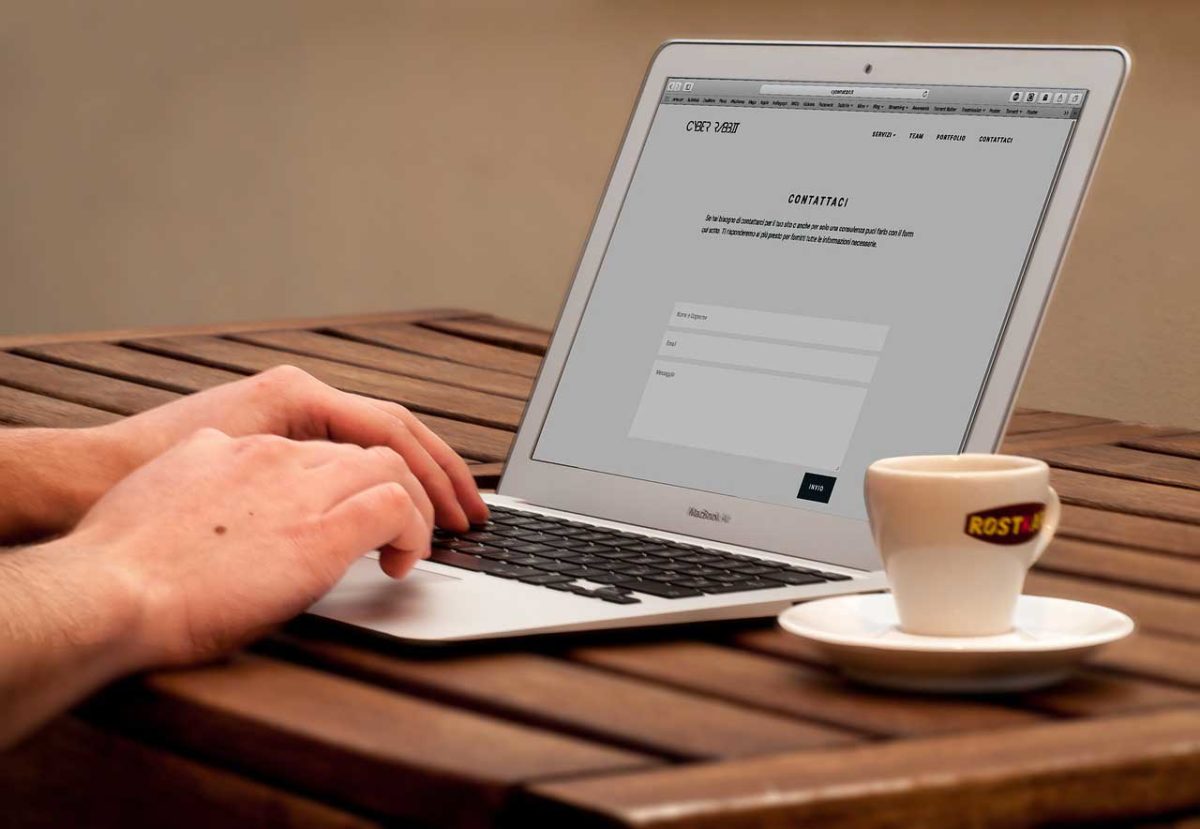
Let’s take the example of the image bloc. Images make a major impact online. The photos and graphics that complement the words on your website are an integral part of build a website. To add an image bloc on Kleap, just click on the add block button. The, choose the appropriate icon: the image button.

You’ll be invited to select a picture from your smartphone / desktop. To optimize your website, don’t hesitate to add a description. Also if you want to link the image to another page or link, fill the url field.

Even when you build a website, images are important. They are used to convey ideas and concepts, describe processes, demonstrate products, services, and experiences, illustrate facts and figures, and reinforce your message. The eye is the Internet’s most powerful communication device, and images are the most effective way to speak to it.

In addition, content is also considered as the backbone of any successful website. If you’re not putting out content that your audience finds valuable, you’re not doing your job. I’m not saying your website should be nothing but content. 

I am saying that the content of your site is the most valuable thing to your users. If you have content that is valuable to your audience then you’ll have people coming back to read more. If they like what they found on your website, they’ll share it with their friends.

If it’s really valuable, they’ll tell their friends about it in person. The truth is that you need content to grow your audience. You can’t just rely on SEO or social media marketing to bring in the traffic. There are ways to optimize these things, but without content, it’s not going to work.

Promote it after you build a website

Getting your website found on search engines is an important part of any online marketing campaign. Search engine optimization (SEO) is the process of affecting the visibility of a website or a web page in a search engine’s unpaid results—often referred to as “natural,” “organic,” or “earned” results. A successful SEO strategy combines search engine optimization (SEO) with other forms of marketing.

Other forms of search engine optimization (SEO) include: 

Link building  – the process of establishing links to a website from other websites, to help search engines determine the site’s importance. 

Social media optimization  – the practice of optimizing a website with relevant keywords so that the website appears in search engine results. 

Content optimization  – the practice of ensuring that the website contains the right combination of words that will help search engines determine the site’s relevance to certain topics.

You didn’t build a website if you don’t want that others find it. We all want our websites to be found online, but how do we do that concretely and easily? I’m sure you’ve heard this phrase before: “content is king”. That is, of course, partially true. But there are ways you can supplement your content with other things to make sure you’re found on the web. You might be surprised to learn that one of the best ways to get your site found by people who are looking for it is through social media. So share us your link in our facebook community to begin.

build a website

It’s not just about posting your content on social media, though. It’s about understanding how social media platforms work and how you can use them to your advantage.

If you’re new to the world of website creation, you may be feeling a little overwhelmed and confused about how to build a website, how it all works. The good news is that there are some easy ways to create a blog without any experience or knowledge of coding. Kleap is a site that specializes in helping you create a website in a few easy steps, and for free.

Categories
Website creation

How to create a website efficiently ?

Content is at the core of online marketing. Without content, you have nothing. There is no point in having a professionally designed website if you do not have good content on the site. Website content is the primary way to connect with your audience and is also critical if you want to improve your search engine rankings. This blog will look at some of the best pratcices to create a website copy efficiently.

The informations that should be on the website when you create a website.

Great copywriting is one of the best ways to improve conversions and set yourself up for success. With this in mind, it’s important to think about the kinds of things that your target audience might be looking for when they visit your website.

After all, you want to make sure that you’re giving people the information they need to choose your business over the competition. Remember, you’re trying to relate to your audience and connect with them on a level where they feel confident and ready to buy.

The homepage.

I’m sure you’ve heard this before: “Content is king” and “users are impatient”. Many users aren’t willing to explore your website to find out what you offer. They will be quick to click that back button on their browser if they don’t see what they want within the first few seconds. 

So, what’s the solution to this problem? It’s simple. When you create a website :

Make your homepage reflect your website’s purpose. A homepage is like a billboard for your website. It should attract users like a magnet, even if it’s their very first time on your website.

– If you have a blog, you can include a few of your latest posts. If you sell a product, you can include a few of your latest product features. The homepage is a great place to showcase special offers, announcements, and even testimonials from loyal customers. Mix it up a bit.

Create a website : take care of the website header.

The website header is the navigation menu at the top of your website that stays the same regardless of which page you visit on the website. The website header, or simply the header, of a website has the primary navigation links of the website, which are usually placed at the top of the website.

The website header is similar to the title of a book. It’s the first thing the visitor reads and it tells them what kind of content to expect. The header is also one of the first things that pops out on the page, so it’s important that it’s well designed. A header is usually used to display the website title.

The pages to create.

To create a website with a great user experience, you have to set goals. You can’t just throw everything up on the screen and hope it works. That’s why it’s important to identify the core pages of your website and decide which pages will branch off of your site header. This makes it easy for users to find what they’re looking for and creates a great user experience.

Your business website should at least include: about page, services or product page, blog, contact.

About page

In the context of the website as a whole, the About page is a great place to share your company’s story. The About page is a great place to tell your story. It’s the place where you can share with your visitors a bit about your company and why you do what you do.

It’s a chance to share your passions with your audience. The About page is a place where you can make a connection with your visitors. The next time you want to tell a story, tell it with your About page.

The services or product page

Product or service pages are one of the most important pages when you create a website. They are the pages which convert the most visitors to customers. But they are also one of the most neglected pages on most sites. If you don’t have good information about your products or services, your visitors will leave your site and look for you elsewhere.

You need to make sure that you are providing enough information about your products or services to keep your visitors interested, but not so much that it bores them.

The blog page

There are many reasons why someone would start a blog. Some want to share their knowledge, some want to make money online, and some want to do both. Whatever your reason, you’re going to need to be able to find it in a hurry when you start blogging and you want to make sure it’s easy to find.

When you create a website, your blog page should be easily accessible in your navigation menu and it should be in a place where it will be noticed. Once you’ve determined where you want your blog to live in your site, you will need to choose how you want to title your blog. You may want to use the name of your blog, or you may want to use a catchy name to draw visitors in.

The contact page

The contact page is one of the most important pages on any website. This is your opportunity to connect with your visitors, listen to their needs, and show them that you are available.

By adding a contact form on your contact page you are making it easy for users to contact you, even without knowing any of your information. A contact form allows you to collect all of the information you need to reply to the email.

The best practices for writing the content on the website.

Writing is an essential part of any website. However, writing for the web is a different beast from what you might be used to. There are a number of ways to make the copy you write for your website memorable and lead your audiences to take action on your CTAs. In this blog post, we’ll share the best practices for writing for the web when you create a website.

The brand voice

The brand voice is the tone you want to use when you are talking to customers or customers are talking to you. It is also really important when you create a website. It allow you to make customers feel comfortable using your business, so you want to make sure your brand voice is consistent across all of your platforms.

This way customers will know what to expect when they are looking at your website or talking to you on the phone or email. Your brand voice is the way you speak to customers, the way you talk to them, the words you use, your tone, and your words.

Write with logic

When you write copy for your site, you need to use logic. Why? Because that’s how people think. Think about it: you don’t write in a non-logical way, so why should your website copy be any different?

If you want to create an effective website, you need to write with logic. If you want to create an effective website copy, you need to write with logic. If you want to create an effective sales page, you need to write with logic. If you want to create an effective landing page, you need to write with logic. If you want to create an effective advertisement, you need to write with logic.

To create a website efficiently, use concise paragraphs. It means a clear and easy to read article. Readers won’t be able to understand a long paragraph. Every time a reader wants to go back to a previous part of the article, they have to go through the whole paragraph to find it. To make your article easy to read, try to avoid long-winded paragraphs. Keep it short and to the point.

Insert images. Images are a fun way to add visual appeal to your content. It makes it more interesting and it can help to drive your point home. This is something that will work well with the articles that you write if you are writing about a product or service.

For example, if you are writing about a product, you can show the product in an image. There are also other ways that you can use images to help you to get your point across. You can use images to show people the benefits of your product or service.

You can also use images to show people how your product is used. It’s important to remember that you don’t have to use images if you don’t want to, but adding them to your content can really help to drive your point home.

Create a website with informations well-organized. The human brain was not built to pay attention to something for a long time. The world is much too complex for us to pay attention to everything happening in it. For example: there are more than 10 million different smells in the world and we can only identify and remember about 10,000 of them.

This is why we need to pay attention to only the most important things. That’s why we use headings when we create a website. They help us identify and remember important information. We can make our readers pay attention to the important things because we will organize the information in such a way that they will see the most important things first.

From now, you know how important it is to have a strong online presence, that is to say, create a website. Having a website that informs and engages your audience is a crucial part of your action plan to launch or revamp your business website. We hope you found this blog post helpful. What about the website creation on mobile?

Categories
Mobile first

7 Best Practices for Mobile First Design

A couple of years ago, when smartphones started to become popular, everyone was talking about the mobile revolution and its hard to find best practices for mobile first design. Most people were dreaming about the day when everyone would be browsing the internet from a smartphone or a tablet. Well, that day has come, and it looks like people are spending more time browsing from their mobile devices than from their desktops.

But the question is, have we adapted our websites to the new trends (or do we intend to do so when we will create our website)? Many businesses have not yet adapted to these trends, and while these businesses continue to provide a user experience that is not so good for mobile users, a lot of users are forced to visit these websites from their desktops. This is a big mistake, and instead of making your users compromise, you should be making your website mobile-friendly. So I want to provide with you these 7 best practices for mobile first design in this blog post.

Prioritize Content 

With a limited screen size, you must make sure that the content is prioritized in a way that users can quickly find what they are looking for. You can do this by placing the most important content in the best spot. For example, the search bar, the logo, the menu, the hero image, the top navigation, and the call-to-action should be placed in a way that makes sense to users.

With so many design elements to work around, it can be a nightmare to keep an eye on every single thing. But you can define a set of priorities that will help you decide what to do with the limited space you have. Not all elements have the same importance and some have to be given more space than others, because there’s a high chance that they’ll be clicked on.

Less content is better 

Even if you must prioritize a website’s content, don’t forget the other best practices for mobi0le first design, mostly : less content is more. Mobile users are looking at smaller screens, so they should be provided with concise content that is absolutely necessary. Smaller screen means less content. If you’re targeting mobile users, chances are you’re designing for smaller screens. But this doesn’t mean that you should just cram everything into the smallest space possible. Smaller screen means less content. If you’re targeting mobile users, chances are you’re designing for smaller screens. But this doesn’t mean that you should just cram everything into the smallest space possible.

The reason why web content is so important is that it can be accessed 24/7, regardless of location. Therefore, organizations should make sure their content is easily understood at all times, regardless of whether it’s accessed via desktop or mobile device. Using images is a great way to make your content more digestible. Images are much more powerful than text because they can convey complex or abstract concepts in an easy-to-understand way.

Provide Intuitive Navigation

There’s one thing that users hate most about mobile websites: poor navigation. According to a research conducted by Google, 46% of users will abandon a website if it doesn’t load fast enough, and this is mostly due to a poor navigation.

Well, you’ll still have to make sure your mobile site is easy to navigate – for both desktop and mobile users.

An efficient navigation structure is very important for your website, if you want to improve the overall user experience. A good navigation structure should be clear at first glance and should be intuitive, so that users can find their way around your website.

Keep it simple

We have a bad habit of filling our designs with visual noise, making them too ‘busy’, too complex, too ‘cool’. However, according to the best practices for mobile first design :

Good design is a good balance between simplicity and functionality. Good design is not about adding everything you can think of. Good design is about the right amount of the right features. Good design is about maximizing your output with the least amount of input. Good design is about providing a great experience. Good design is about the user, not yourself. Good design is about the product, not the designer. Good design is about the content, not the container. Good design is about the user, not the technology. Good design is about the message, not the medium.

Test on Real Devices 

If you are creating a website both for desktop and mobile, then it is essential to test your website using real devices (desktop, smartphones and tablets). It is important to test on real devices to see how the result will be and to check if the render meets your expectations.

There are many different ways of testing your website, but nothing beats testing it on real devices, so that you can see what your users will see. If you are building a website, you always want to test the website on real devices.

With Kleap, you create your website on the mobile first. Like I always said, the desktop version is automatically generated. So the test is easy to do. All you have to do is to preview the result in the desktop version.

best practices for mobile first design

Always keep the users in mind

Aside from the technical side of things, mobile-first design is about prioritizing users’ needs. It’s what makes the difference between designing a product with the user in mind and designing a product for yourself or your business. Moreover, I just write a blog post about the creation of a business website if you want to know more about the best practices for mobile first design applied to the business.

It’s about making sure you’re building for them, not for you. Mobile-first design is about putting the user at the center of your product. It’s about ensuring they have what they need, when they need it. This is what makes your product usable, usable, usable. And it’s what makes your users happy.

So, what do your users want? That’s the most important question you must ask yourself when you’re designing a new site, app, or any other form of digital content. If you answer this question before you design anything, you’ll be able to design for your users.

You’ll also be able to learn from your users, which is critical to the success of any product. And you’ll be able to determine if your product is actually working, which is important if you’re trying to sell something. If you’re not thinking about your users, you’re not thinking about design. User-centered design is all about your users. You may think that you don’t know your users very well, but the truth is that you probably know your users better than you think.

All you need to do is ask yourself a few questions about your users to learn more about them : Who is your user? What do they need? What do they want? What are their problems? What are they struggling with? If you know these things, then you’ll be able to design something that your user will actually want. That’s the most important part of user-centered design.

7th best practices for mobile first design : Don’t forget the CTA

Call to action is a widely used feature of websites, particularly those that are looking to boost their sales. Visitors to a website are likely to be scanning the text instead of reading it, and a call to action is a great way to grab their attention and persuade them to take a particular course of action, such as making a purchase. 

If you are not using CTAs to drive traffic to your page then you are probably missing out on a lot of traffic. Moreover, we have the adaptive block for the CTA in Kleap, to facilitate its insertion.

Mobile first design is a design strategy for websites and applications. If you want to know more about it, please visit our another blog post about the mobile first approach and its importance. It is one of the most popular trends today and a very good way to make a website usable and accessible for a big audience as long as you do it the right way. In this article we have collected the best practices for mobile first design to have a successful website.

Categories
Mobile first

Mobile first or Responsive design for your business website ?

A website is the first thing that people look at when they are considering using your business. It’s very important that you do everything you can to make it work for you. However, there are many changes with the arrival of new technologies. An average user is spending more time on mobile devices than any other hardware. We are living in a time where it seems like every website needs to be responsive. But is responsive web design really the best way to build a website? Is mobile first the best way instead?

What is Responsive design?

Responsive design is the most popular when it comes to designing for multiple platforms. There are two types of responsive design when it comes to mobile devices :

– The first one is the fluid responsive design in which there is no fixed width to the layout. 

– The second one is the adaptive responsive design in which the content is scaled according to the device used to display it.

As the mobile web went from being a novel technology to a mainstream convenience, there was a lot of talk about responsive design. The idea is that the same website would look good on a desktop monitor and a handheld device. Media queries and fluid grids became a must-have feature in a web developer’s toolbox, and a lot of big news sites have started to go with responsive design.

Mobile first vs responsive

What is Mobile First design?

Mobile first design is a web design concept that suggests that responsive design should be reversed. Rather than use the same design and scale it up to fit smaller screens, we should start with the smallest screen sizes and design for them first and then scale up and increase functionality and features as we go. Mobile first design is a principle that suggests we should design with the smallest screen first and then scale upwards. If you want to know more about the mobile first approach, you can read our other post blog.

While responsive design and mobile first design deal with similar problems — how to display a website on different screen sizes — they solve those problems in two different ways. They also aim to solve different problems. They’re often mentioned in the same breath, but they’re actually pretty different.

Mobile First vs. Responsive Design

Mobile first or responsive design? This is one of the most frequent questions I get asked about web design. The reality is that most web designers are now adopting a responsive approach to web design. Mobile first is a design approach that is based on the concept that the mobile experience is the priority. All content is built around the mobile experience. It’s essentially a starting point for your design. You start with the smallest screen size and build your design from there. It is the idea that you build the smallest design possible for your content.

It is very different than responsive web design, which is an approach that works with the idea that one website can respond to all screen sizes. All content is built around the desktop experience. You start with the largest screen size and work down.

Because responsive design is more popular, it is easy to think that mobile-first is not used anymore. That is not the case. Just because responsive design is the most popular method doesn’t mean it is always the best method. If you are starting a website from scratch, you should always consider mobile-first.

Which one should you choose?

The one which is better for your business

A website is the backbone of any business. It is where you get to sell your products and services and is the first place most people will go to in order to check you out. A website is a great asset to any business and can be an incredibly cost effective way to get your business in front of large audiences. So what type of approach is best for the creation of a website for your business?

Both are great design choices that can be used for any business or website. But which one is the best for your business ? Well, it depends on your business and what you want to achieve from it.

No one can deny the fact that the internet plays an important role in our lives. It has changed the way we carry out our daily tasks. More and more people are using the internet to search for products and services, to read the latest news and to buy stuff online. If you are thinking of starting your own online business, then you’ll need a website that is compatible with the latest technologies. Mobile-first design is one of the best ways to create a website for your business.

Why Mobile first is better?

For its ease of use

Mobile first is better than responsive because it’s simpler. It’s simpler to understand, it’s simpler to create, and it’s simpler to maintain. If we consider Kleap, creating a website with Kleap is really easy. You just have to drag and drop some blocks. When it’s finished, a desktop version of the website is automatically generated.

The responsive design trend started way back in 2010 when Ethan Marcotte wrote the article Responsive Web Design which introduced the idea of not just creating a single version of a website, but instead building a series of small, responsive websites that work on any device.

Mobile first has been a buzzword for a few years now, and we’ve seen a lot of companies make the switch and redesign the way they deliver their content on mobile devices. But what does it really mean? Does it mean you should put your mobile first and your desktop second? Does it mean that you should throw out your desktop website design and just go mobile? No, it’s not about that.

The idea behind mobile first is that you should design your website with mobile devices in mind. So, even if your website is designed with desktop users in mind, you should still design it so it’s mobile friendly. Even if your desktop users don’t notice the changes you’ve made. If you’re currently designing your website and want to follow mobile first, here’s a simple checklist:

For its price

This is not about how mobile responsiveness is cheap, but rather how the mobile first approach is cheap for small businesses. When you’re a small business, it’s important to have a limited budget for your website.

As I said earlier, the mobile first approach means that you start designing for mobile first. That means that you design one layout that then scales up for desktop. This way you don’t have to worry about mobile design first and desktop design later. This makes mobile first design cheap. Why?

Well it simply cuts out the unnecessary time you would spend designing for mobile if you were to do it the other way around. The reason I think mobile first design is cheap is because it cuts out the time you would spend designing for the mobile only. The mobile first approach is easy to implement and maintain.

A website is a powerful tool that can help your business be more successful if you create it the right way. It can help you reach more potential customers, get more leads, and make more sales. It only remains to make sure your website is doing its job.

Categories
Mobile first

Why You Should use the mobile first approach when you create your website ?

A mobile first approach strategy has become a common way of designing, developing, and building websites. However, many businesses are still struggling to adopt this approach. I’m here to tell you that you should definitely give it a shot! There are many benefits to taking this approach. First, it has been proven that people tend to interact with webpages differently on phones than they do on desktop computers. Second, many people are using phones to browse the internet today. You’ll be missing out on potential customers if your site is not mobile friendly. Last but not least, having a mobile-first website will boost your SEO rankings! More precisions in this article.

What is mobile optimization?

Mobile optimization is one of the most important aspects of modern site design. It involves the use of various techniques to make sure that your site makes the best of its resources, regardless of the device it’s being viewed on. It’s no longer enough to make sure that your site is mobile-friendly – you need to make sure it’s mobile-optimized. That means making sure your site is fast, responsive, and easy to use regardless of the device it’s being viewed on.

Mobile-first design is also a web design concept that essentially says that a website should be designed primarily with the mobile (smaller screens) user in mind, and then be extended for desktop users. In other words, web designers and all those who want to create a website should create a version of the website for mobile devices first, and then adapt the layout for desktop devices. 

Finally, the mobile first approach, which has become very popular with the rise of smart phones and tablets, is considered to be the best way of designing a website. A lot of web designers are moving away from the traditional desktop-first approach to mobile-first web design. The first step is to create a mobile version of the website, which can be done by using a tool like Kleap. After the website has been created, the tool automatically adapts the design for desktop users.

Why Mobile Optimization matters?

It’s important to consider mobile optimization because of the growing number of mobile users. In fact, eMarketer predicts that by 2020, there will be more mobile users than desktop users. This is why it’s so important to optimize your website for mobile devices.

For the user experience

The mobile world is rapidly changing, and every day new mobile devices are hitting the market. One fact remains constant: people use mobile devices to check their email, look for directions, check the weather, and get the latest news. In fact, people spend more time on their mobile devices than they do watching television. That’s a lot of time to be spending on a device that makes doing things difficult.

Mobile optimization can benefit any business or website by improving the user experience (UX) of the site. A website may be mobile optimized by using different strategies like using smaller images, reducing the number of clicks, and providing an easy way to navigate the site.

More interest from users

Mobile users are the new customers and they want to be understood and appreciated for who they are and what they do. We all want to be welcomed and comforted in a new environment, and we want to feel like we’re part of a community. As we increasingly look for ways to connect and interact, we’re looking to mobile devices to serve as our primary gateway to the Internet and the digital world.

If you design and build a mobile-friendly site, you’ll be able to keep up with your customers on the go, and provide a more streamlined, consistent experience across all devices. This doesn’t mean that the desktop site will cease to exist. In fact, a mobile-first approach can greatly benefit your desktop site, as it will allow you to design a site that is more tailored to your customers’ needs.

For the SEO result

As the popularity of mobile phones increases, search engines are giving more weight to mobile-friendly optimized websites. This means that if you aren’t mobile-optimized, you will be at a disadvantage when it comes to search engine results.

Impact of mobile first approach in business

How mobile optimization can impact your business?

Your Mobile traffic will growing. The number of desktop users is decreasing. Mobile searchers are more likely to convert. Mobile devices are getting more powerful. Mobile is becoming the first point of contact between consumers and brands. Mobile optimization is therefore important for businesses of all sizes.

Once you have a website that is mobile-friendly, you can then try to increase the conversion rate of the site by making it more responsive. If you are wondering how that can impact your business, here are several reasons you should be using a mobile-first approach.

The role of mobile in your marketing strategy.

Mobile is more than just a trend. It’s an emerging trend that is here to stay. As of 2016, there are more mobile searches than desktop searches, more mobile-only websites than desktop-only ones, and more mobile devices than desktop devices. If you are planning on being a successful website/business owner, you will need to integrate mobile into your marketing strategy.

With the rise of mobile devices, marketers are coming up with new ideas on how to connect with buyers. As a marketer, you must recognize the importance of the mobile channel in the digital marketing mix. A ‘mobile-first’ approach, although challenging, can help you create better user experiences, improve lead generation, and increase customer engagement. The most important thing is to make it work for your specific audience and business.

What are the different ways to optimize your site for mobile?

There are many ways to optimize a website for mobile :

Make it responsive design and mobile friendly

In a recent report from Google, it was found that nearly 30% of the Internet is now mobile. That’s a huge chunk of the Internet, and not having a mobile-friendly website could be the difference between a satisfied customer and an unsatisfied one.

A responsive web design is a web design that adapts the layout to the viewing environment. This may include adjusting the size, and also the content (and behavior). A responsive website detects the screen width and adjusts its layout accordingly to provide a pleasant viewing experience. This means that your website will adjust to the user’s device.

Make sure your responsive design website works very well and easy to use

As the world becomes more and more mobile-centric, it can be tough to make sure your site is as easy to use as it should be. As a business owner, you need to make sure that your site is easy to use and that your customers can easily access all the information and products they need and want.

Kleap mobile first

Use Kleap when you build your website

If you are starting with a website builder, there are some great tools that will help you to optimize your website for mobile users. Indeed, you can easily add a mobile version of your site. With Kleap, you’ll create the design of your website on mobile. Then, a desktop version will automatically be generated. But make sure you test your mobile site after you add it. You may want to make a few small changes to make your mobile site even better.

Conclusion

The world is becoming increasingly mobile, and a “mobile-first” approach is a good way of ensuring that your business takes advantage of this. As we saw in this article, it brings many advantages: for the users, for the SEO, for the marketing, and for the business. Thank you for reading, we’re always excited to share our thoughts with you!